Strathearn Bathroom and Living Room Refresh
One of the services we offer to our Realtor partners is our Pre-Sale Consultation, during which we spend an hour with homeowners to give them advice and guidance on putting their home’s best foot forward to attract the right buyer. It was during one of those consultations that I had the absolute pleasure of meeting these clients. They were ready to sell and move on to a new home, but after they implemented a few of the recommendations I had for them … well they decided that maybe their current home could work for them with a few additional updates. Yep, our own little ‘love it or list it’ moment!
There were 3 main rooms that needed to be addressed: the basement main area, the living room and the family’s main bathroom. We also updated the bedroom window coverings and the paint colour throughout the space. We won’t touch on the basement here, as new carpet and updated lighting did the trick, but we did take on a more substantial partial renovation in both the living room and bathroom.
Where we started
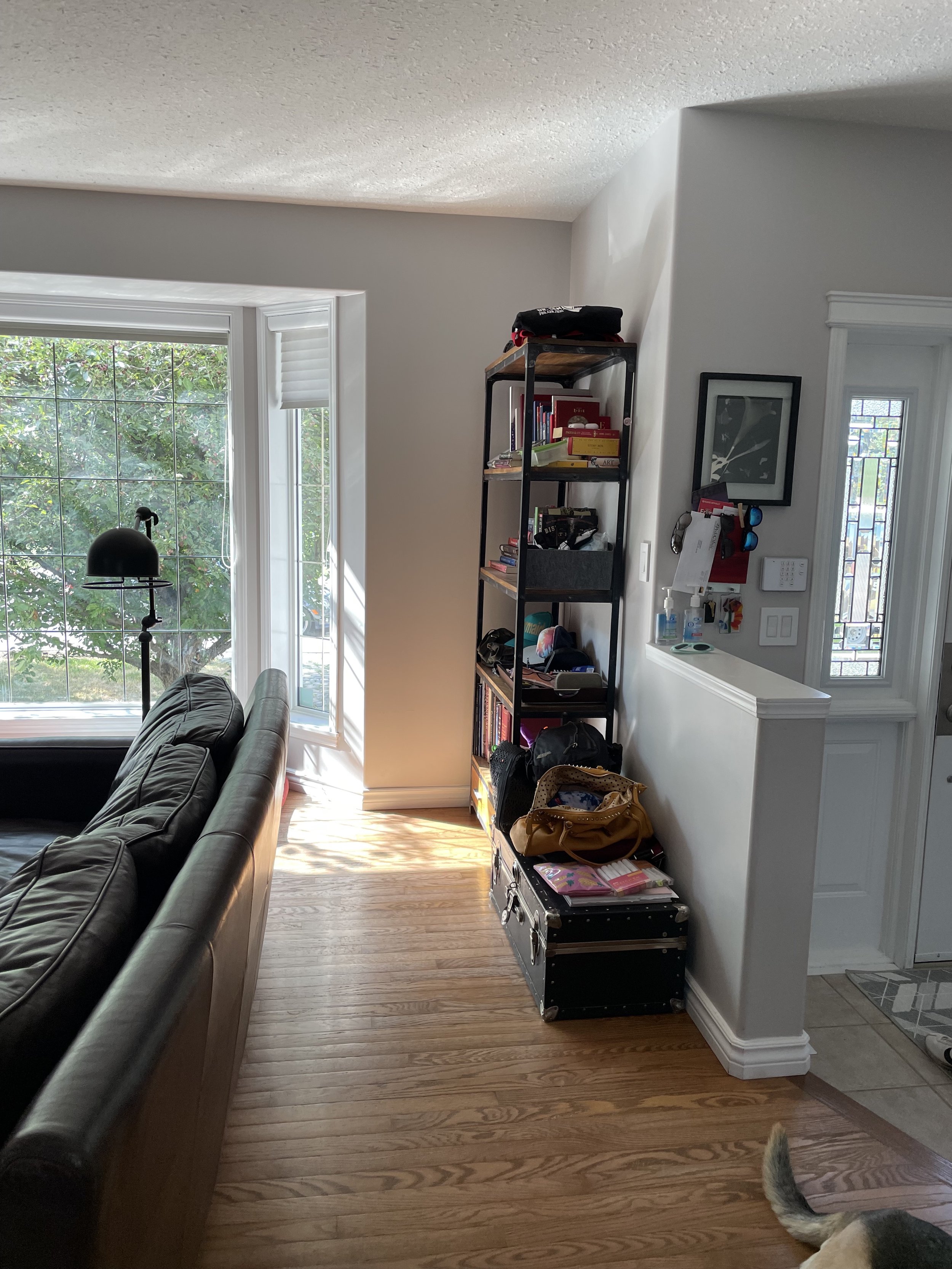
The living room (and technically also the dining room) space wasn’t quite functioning to its full potential. Storage was an issue, as our clients are always creating and crafting, but it was important that this storage felt purposeful and looked good in the space. The fireplace was feeling dated and didn’t match their style and vibe, so it was added to the list. Finally, we also replaced the existing dining chairs with new ones that add a pop of colour, as well as a bench to open it up a bit.
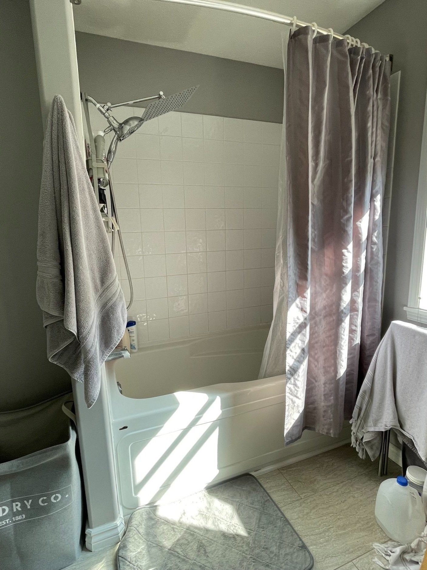
Upstairs, the main bathroom had been updated previously but our clients were really looking for a more luxurious experience when it came to their tub / shower combo. They wanted a larger tub and better storage space, along with a rain shower!
The design
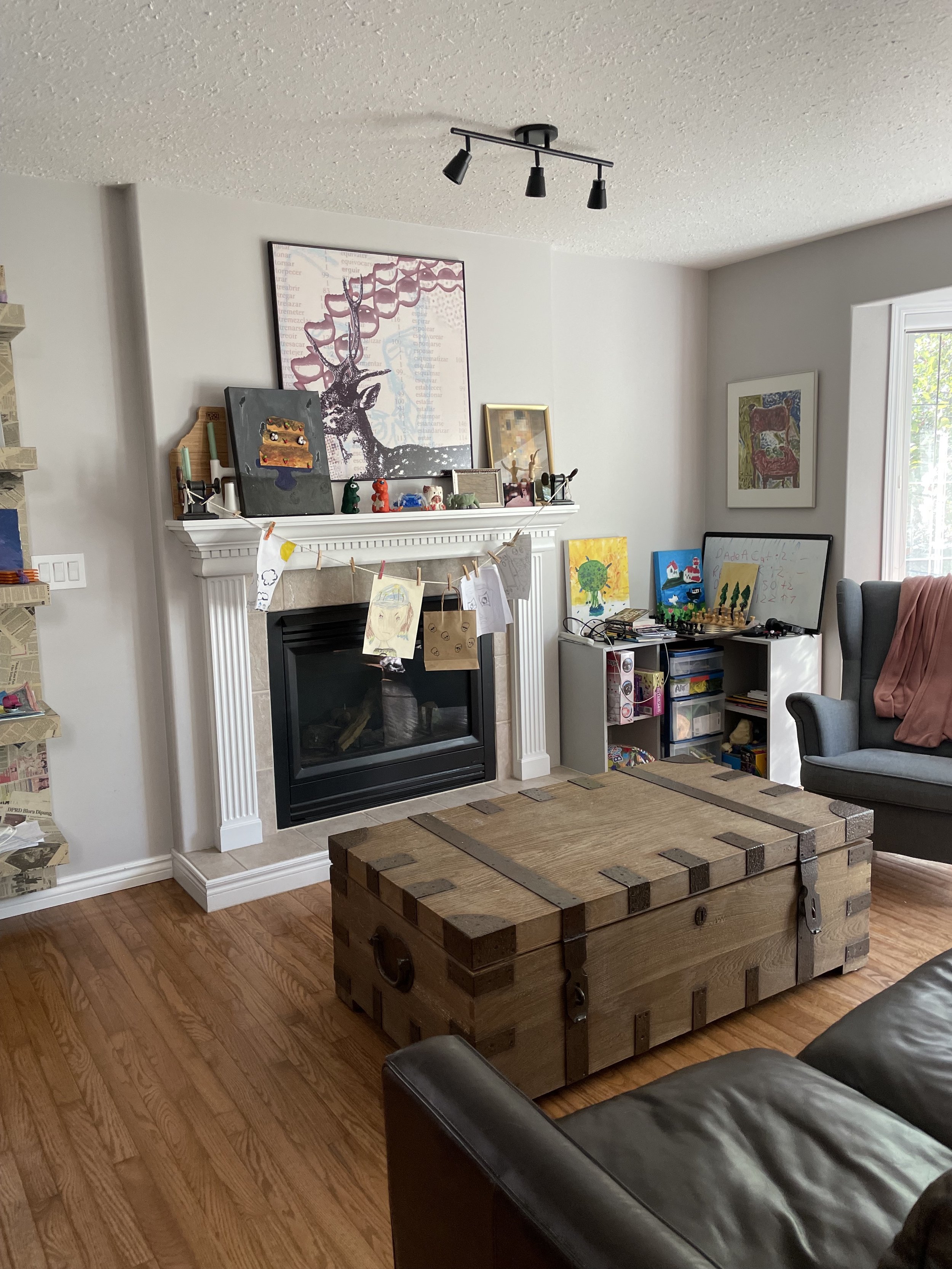
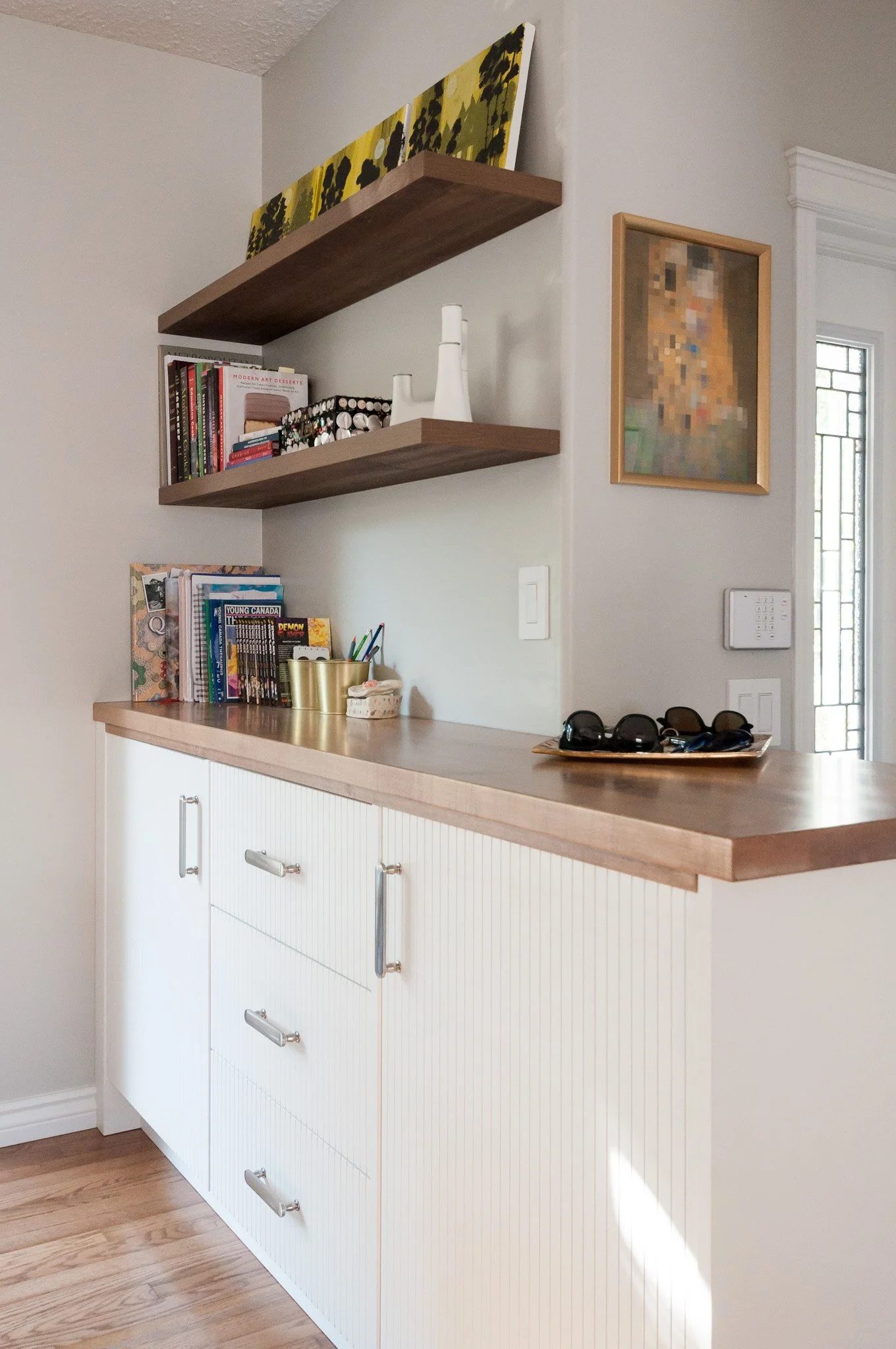
We contemplated several options for the living room that would incorporate the storage and the fireplace together and created a library-like feel around the window, but the design that won out over the others was to replace the existing bookshelf with built-in cabinets and floating shelves. We designed it in such a way that it incorporated the half wall that separates the entry from the living room which made it feel quite purposeful, as though it was always meant to be that way.
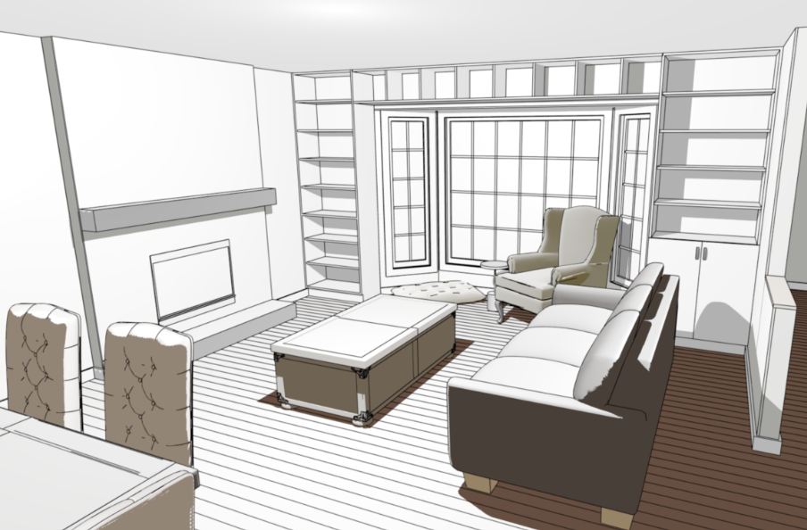
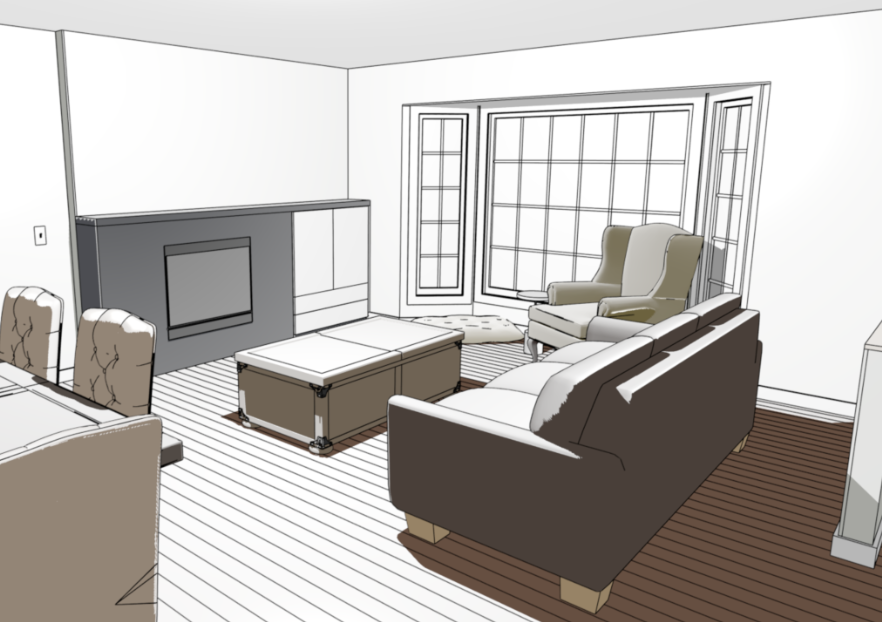
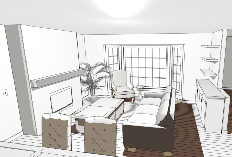
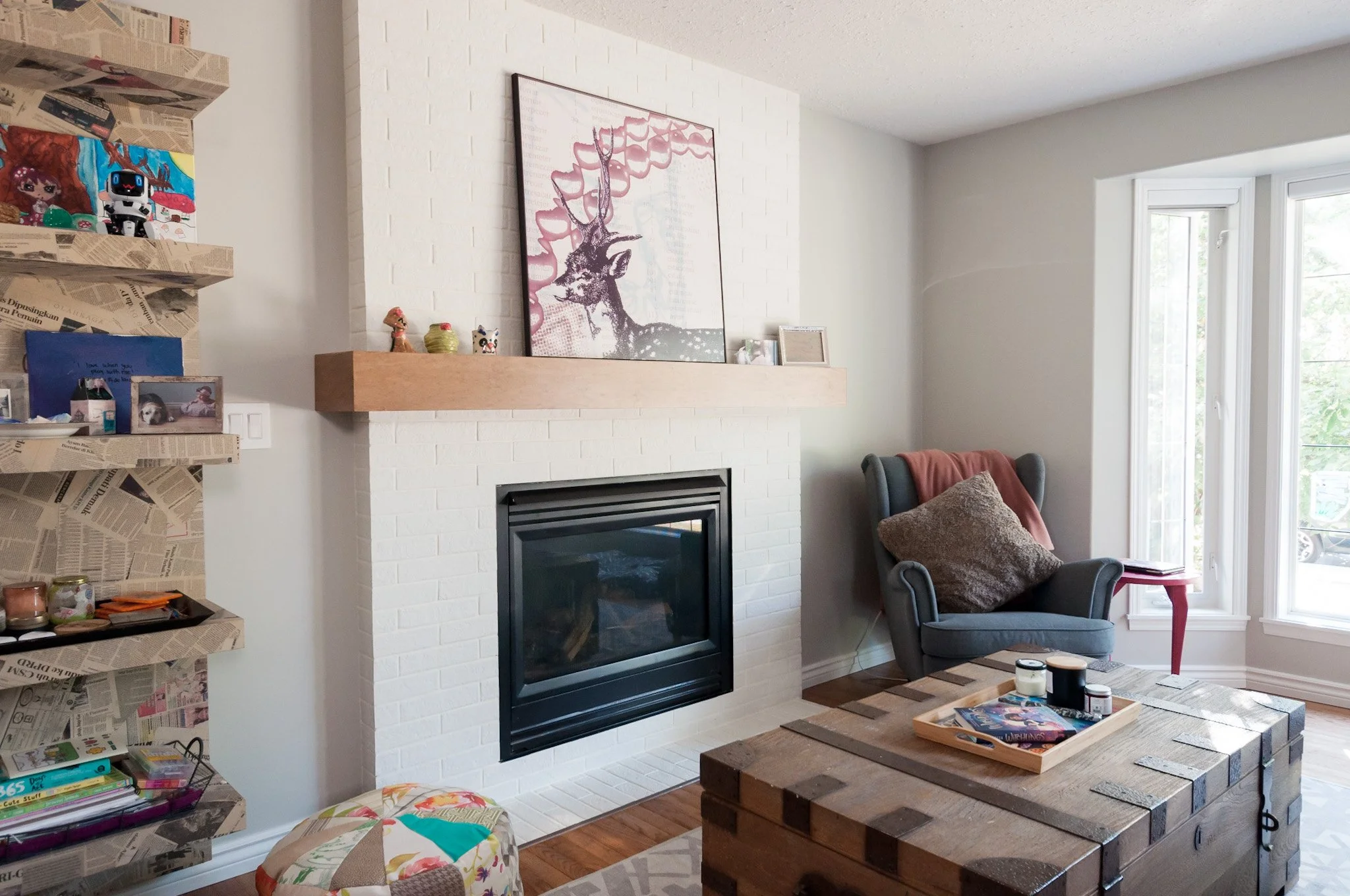
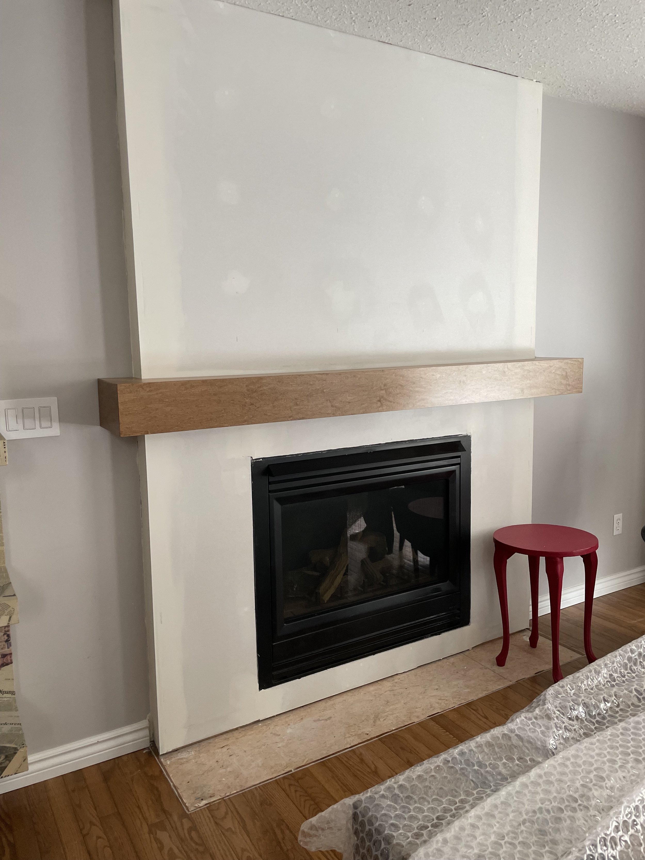
The fireplace went clean, classic and modern with white brick tile, the removal of the built up hearth, and the addition of a custom wood mantle. We still utilized the existing fireplace insert, and the end result was a more streamlined look which also gave space back to the room.
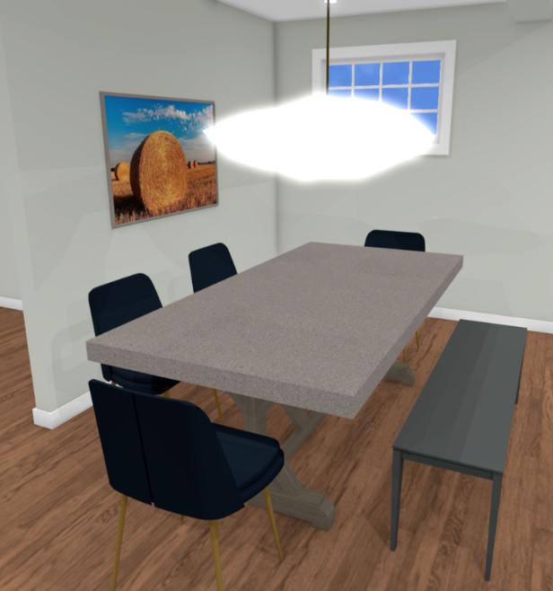
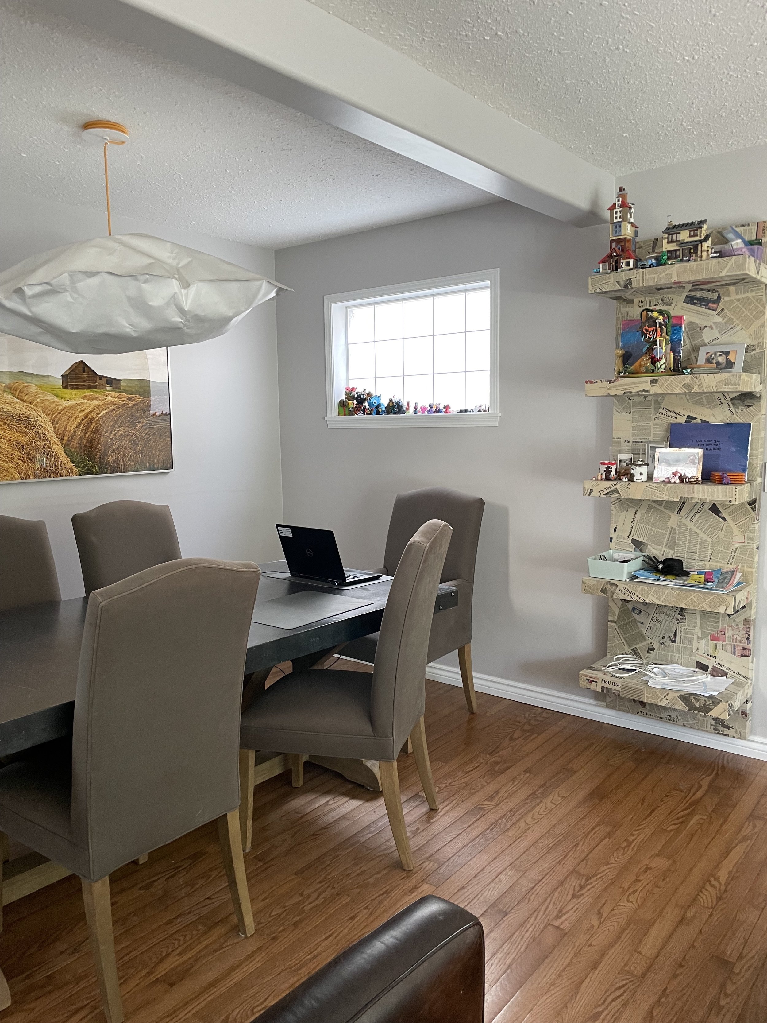
Over in the dining area we added a pop of colour with blue velvet chairs, and additional texture with the leather dining bench. Making the switch to these smaller scale chairs and the bench made the space feel less crowded and more open.
In the bathroom, we considered either an arched entry or a rectangular option, and then two options for the niche placement so that they had lots of storage for the three of them.
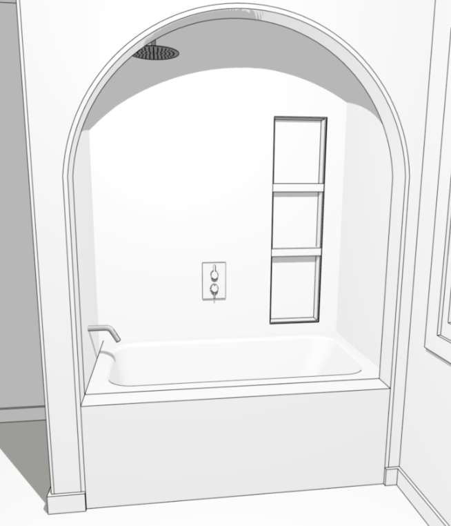
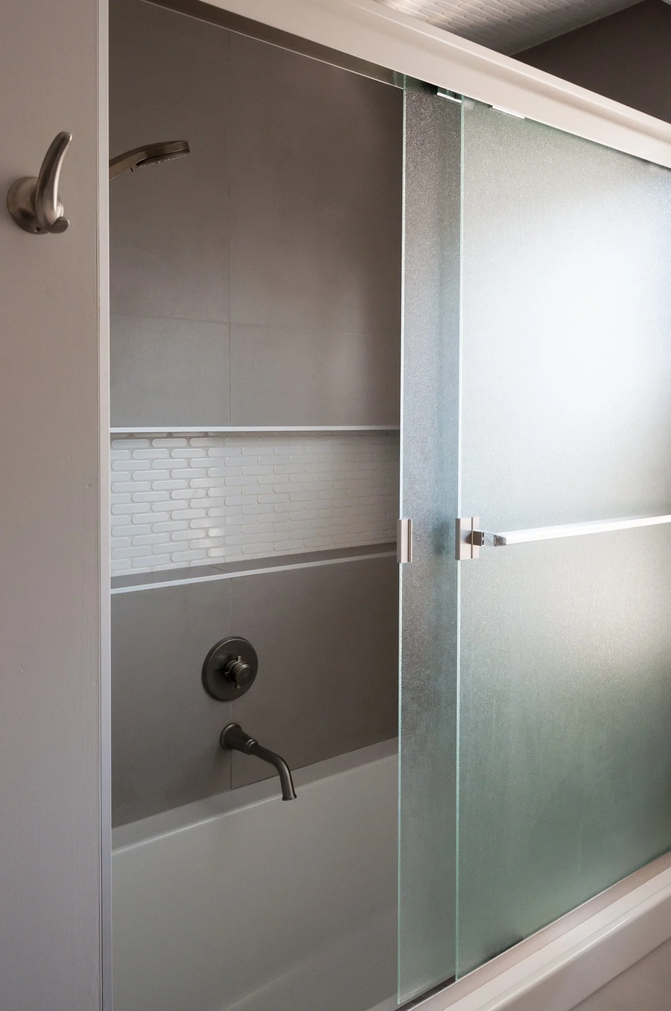
The rectangular option was chosen with the long, wall-to-wall niche. Our clients love gray and use it throughout their home as a backdrop for their beautiful art collection, so that was embraced in this space too.
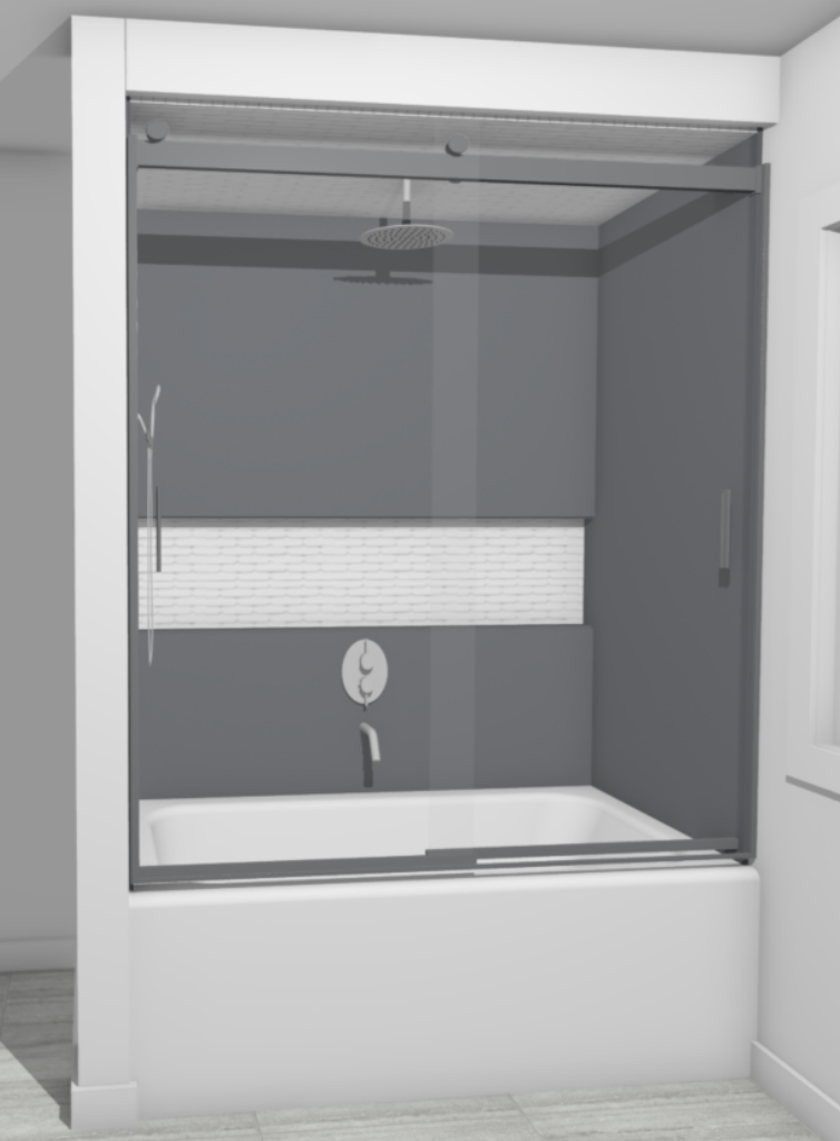
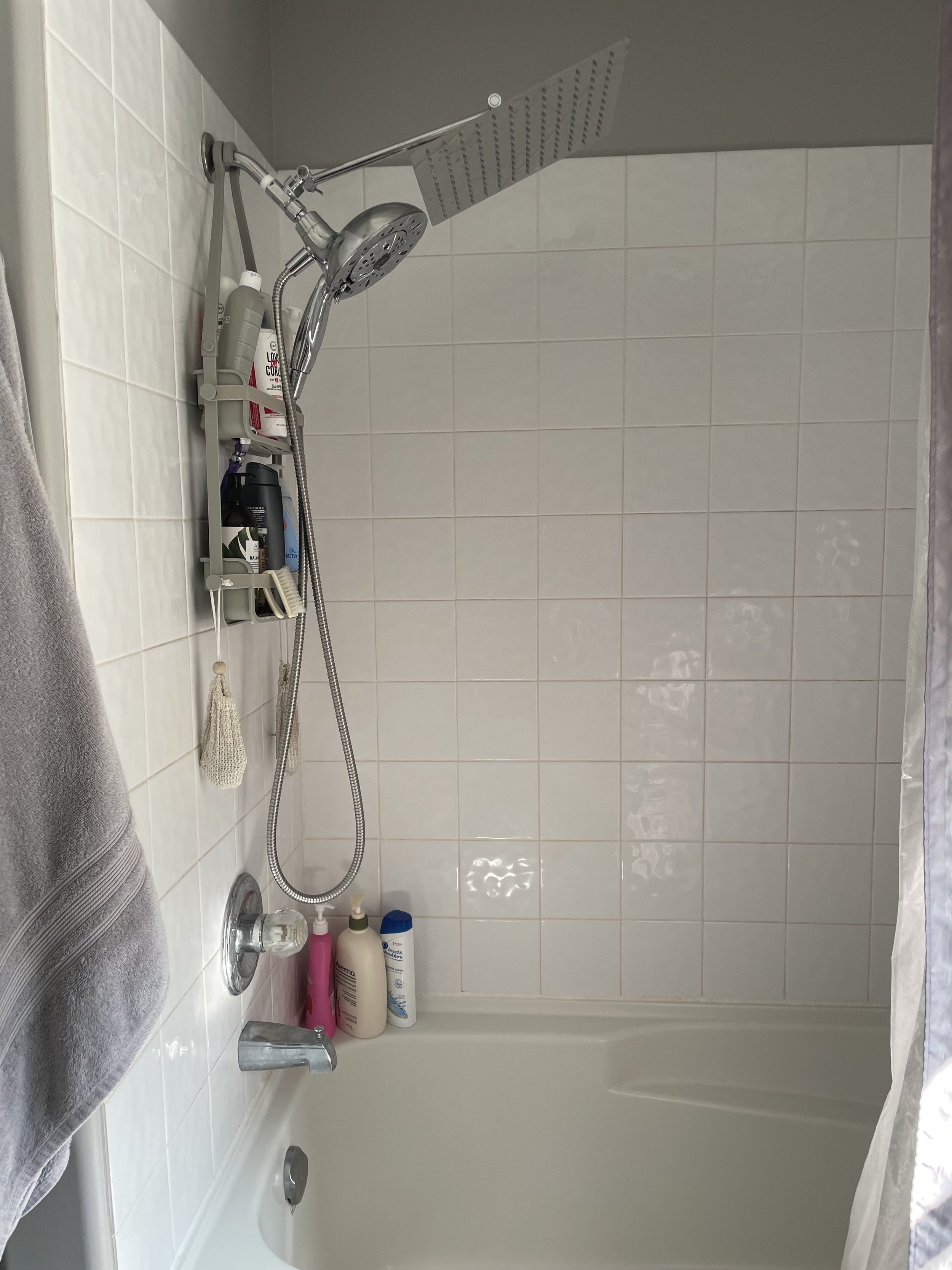
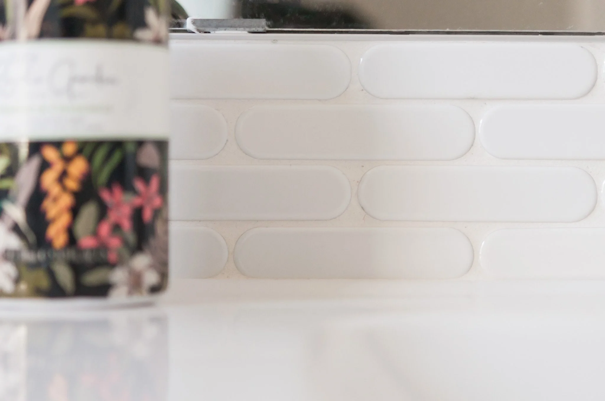
We picked out large format gray tiles for the surround and a white pill-shaped mosaic to accent the niche and the ceiling. The only change from our initial design was the shower door, where our client wanted to go with a frosted glass instead of clear.
The renovation
I always say that no renovation will go perfectly. There is always at least one thing that isn’t going to go to plan – whether it’s a surprise during demo or a scheduling issue or a malfunctioning part. This renovation was no exception to this rule. In fact, there wasn’t just one thing that went wrong, there were multiple. It was stressful for everyone involved but I have to give huge kudos to my clients for staying as calm and understanding as they did. And like all renovations, once you’ve gotten to enjoy the new space for a while, the memories of the stress and frustration tend to fade away.
Our first challenge was finding a vent where we weren’t expecting it in the wall. After some problem solving between myself, our contractor and the plumber, we sorted out a way to reroute it to the inside corner so that we could keep the big feature of the tub – the wall to wall niche.
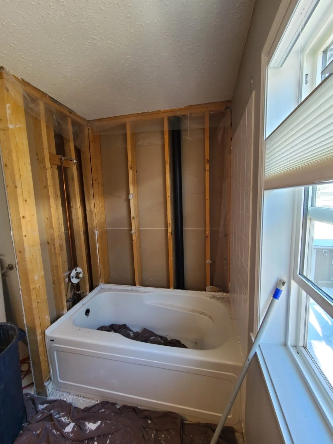
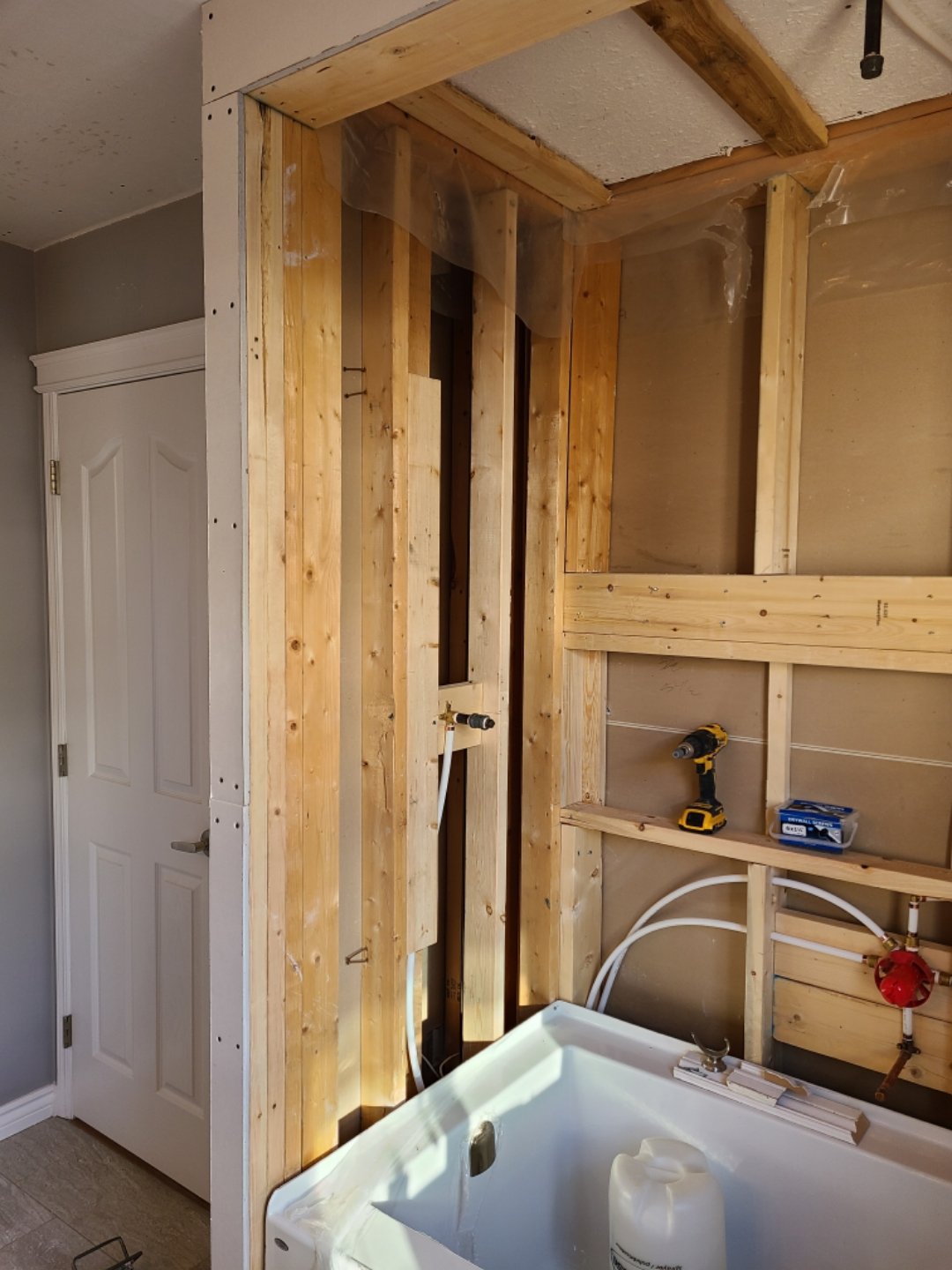
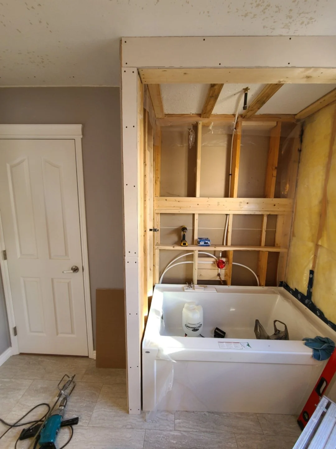
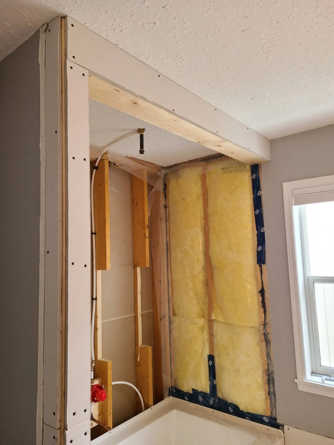
You can see that we also built out the existing wall, as the new tub was wider than the original, and added a bulkhead above to create a more intimate feel when in the tub.
Our next challenge involved a bit of a mishap – some of the ceiling drywall was damaged. Items like this can be super stressful, especially if you don’t have good relationships with your trades. I’m grateful that in this case, everyone worked together, taking responsibility and ensuring it was sorted and fixed – and the end result was a new bathroom ceiling for my clients! I won’t go into all the details, but needless to say it didn’t end there. The project that should have been about a month (since we had pre-ordered all our items) ended up taking months. Between having to bring in additional pieces of our special order tile (we had to remove some after it was installed) and then our trades fitting rework into their already busy schedules, it was a lot. Again, I’m so grateful to have clients who trusted me and trades who made it work, took ownership, and were flexible, despite it feeling like everything that could go wrong was going wrong.
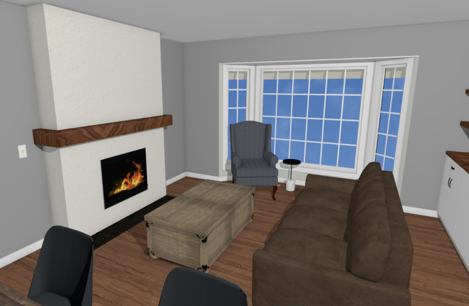
Over on the main floor, things were a bit smoother. The existing fireplace surround came off quite easily with minimal damage. And with the exception of the wall not being level on the storage side, it was a relatively straightforward installation too. One of my favourite parts of the storage and fireplace is our two custom pieces: the countertop and the mantle.
In reality, we didn’t officially finish the project until July 2022 (just shy of a year after our clients reached out about starting on the renovation) as we waited for that one last item to arrive: the dining table bench. It was a custom order that faced a few delays, like so many of the items we’ve ordered in the past two years.
The finished space
First up, the living room.
While the changes we made to this space were relatively minimal, it just feels so much more like my clients now. It’s more their vibe. It’s also more functional from a storage perspective, and feels more open around the dining area with the lower profile chairs and bench.
Upon entering the home, you’re greeted first with the new storage and countertop, incorporating the half wall between the entry and leading you from the entry and into the updated living room. Our clients told me that their guests who saw the space said it felt like it was always meant to be this way, which I love hearing!
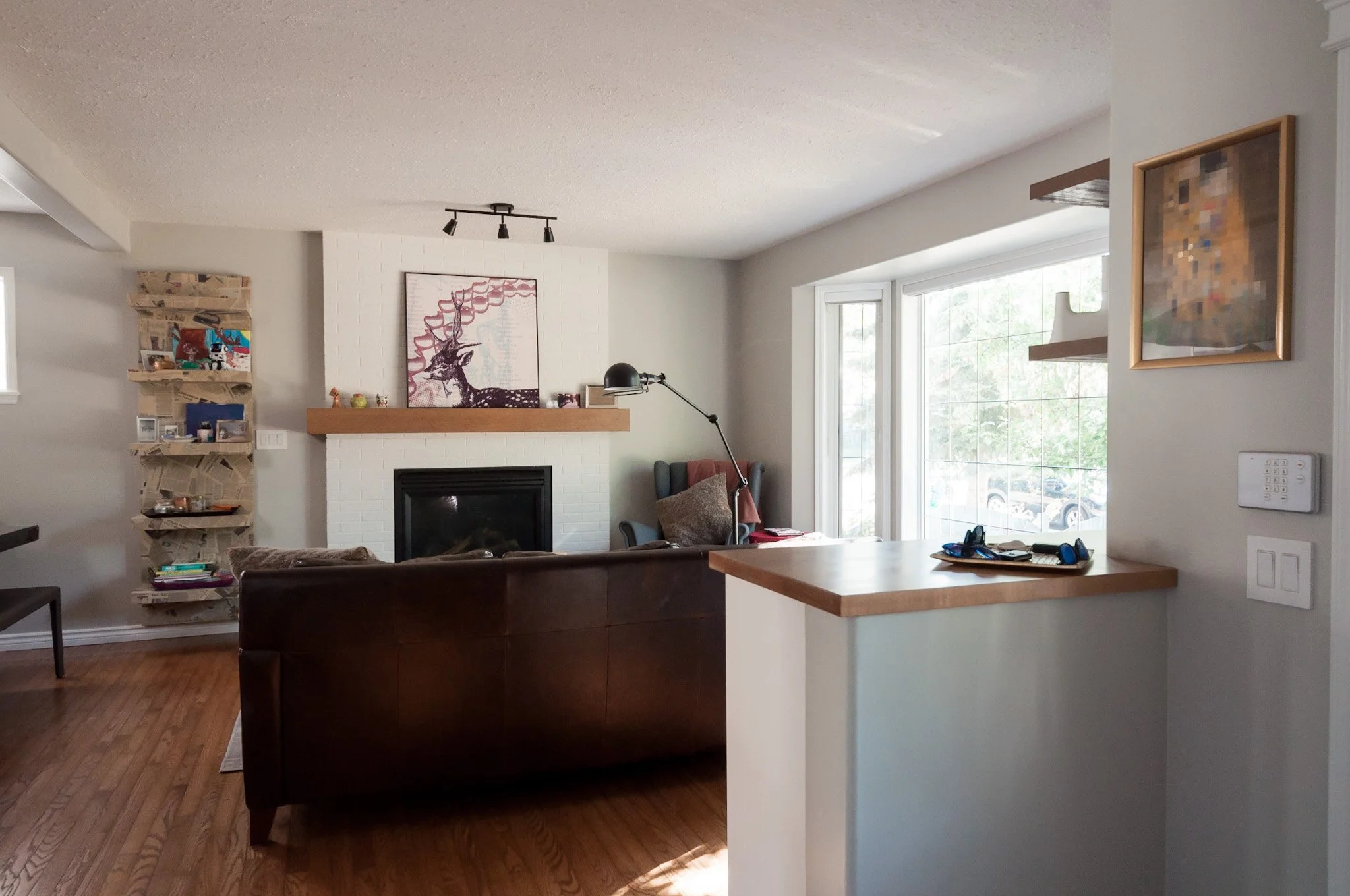
The more modern but also classic take on the fireplace feels purposeful. It doesn’t overtake the space like the old one did, but now acts as a focal point as well as a support for the art and decor.

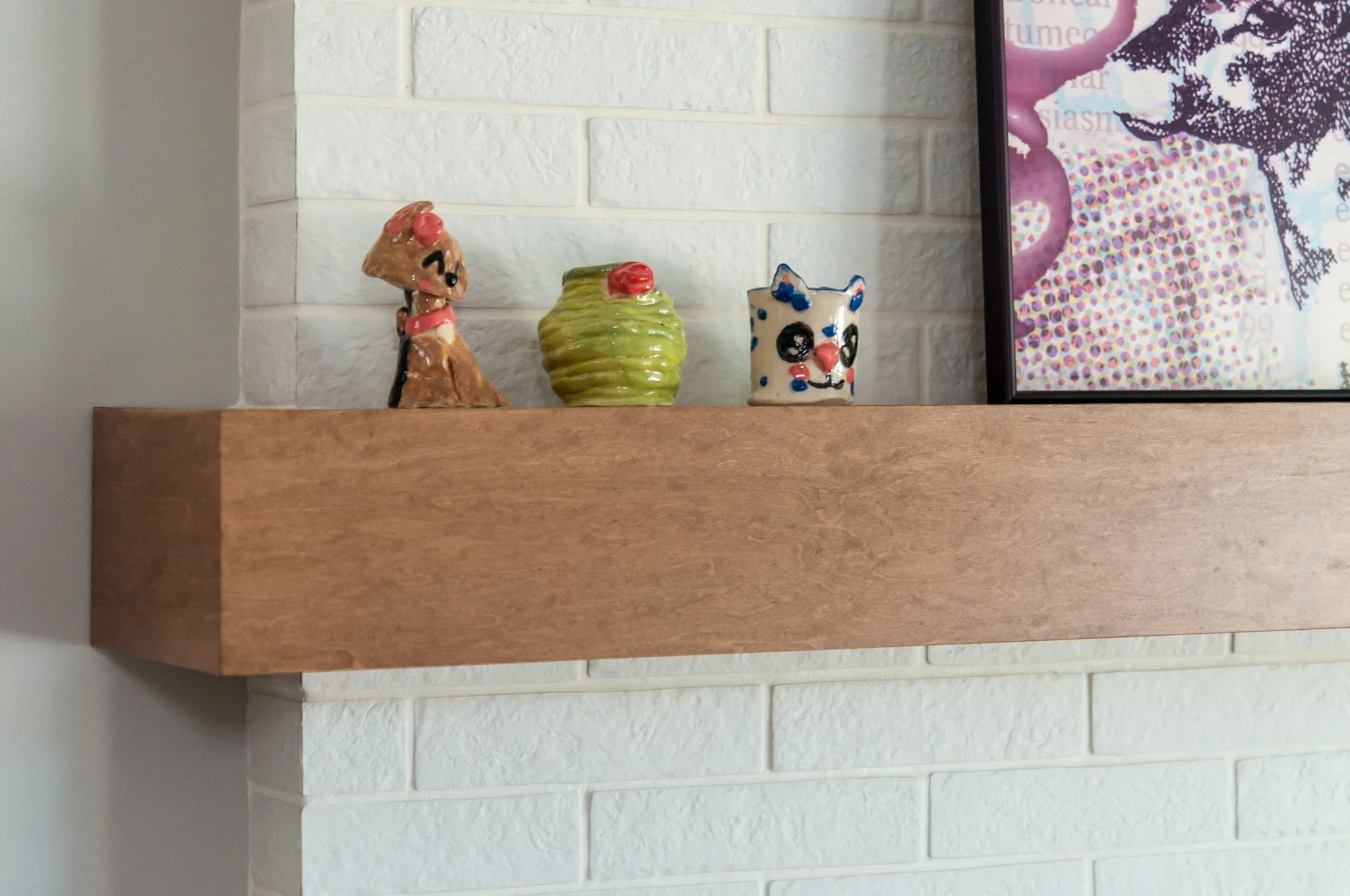
While we’ve used a brick tile, the mitres and layout give the impression of full bricks. The custom maple mantle still has space to display art and decor, but by incorporating the wall’s jut out into the overall fireplace, it again provides a more seamless look.
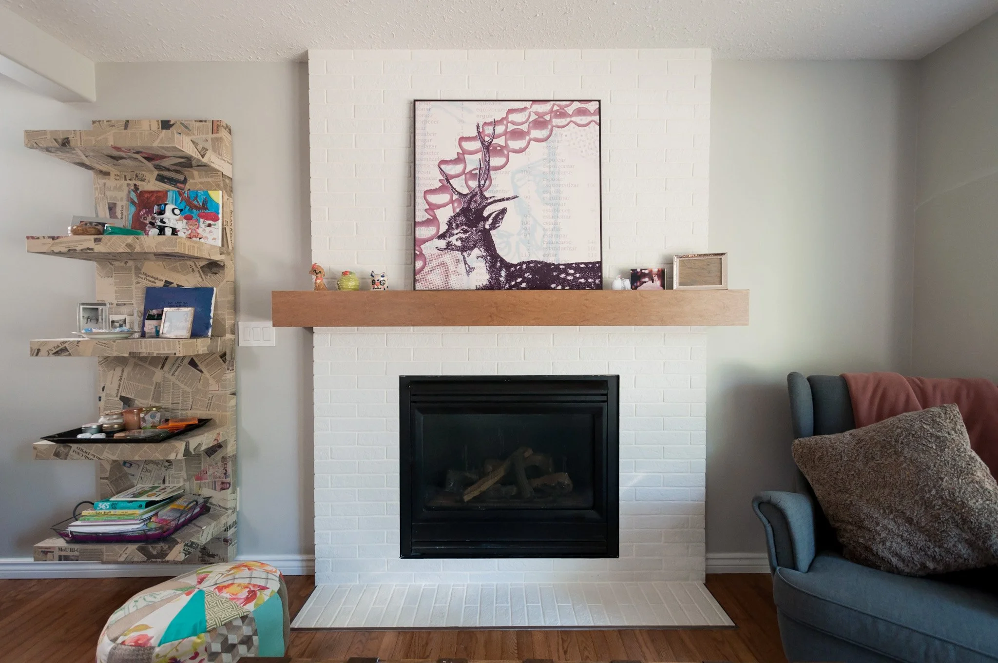
Back over on the other side of the living room, we used standard cabinetry to provide a place to store games, crafts and more with two shelves above and a set of three drawers below.
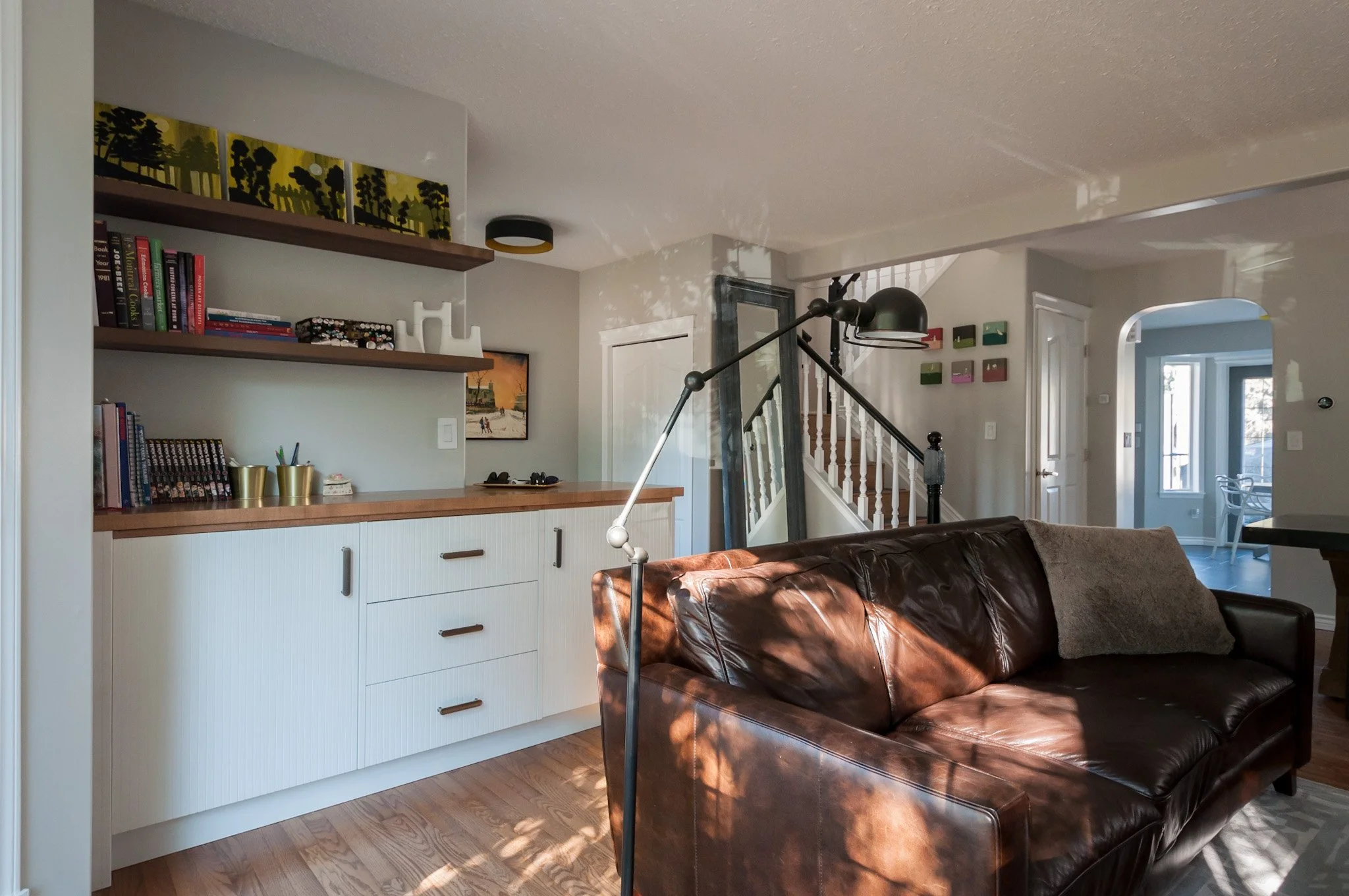
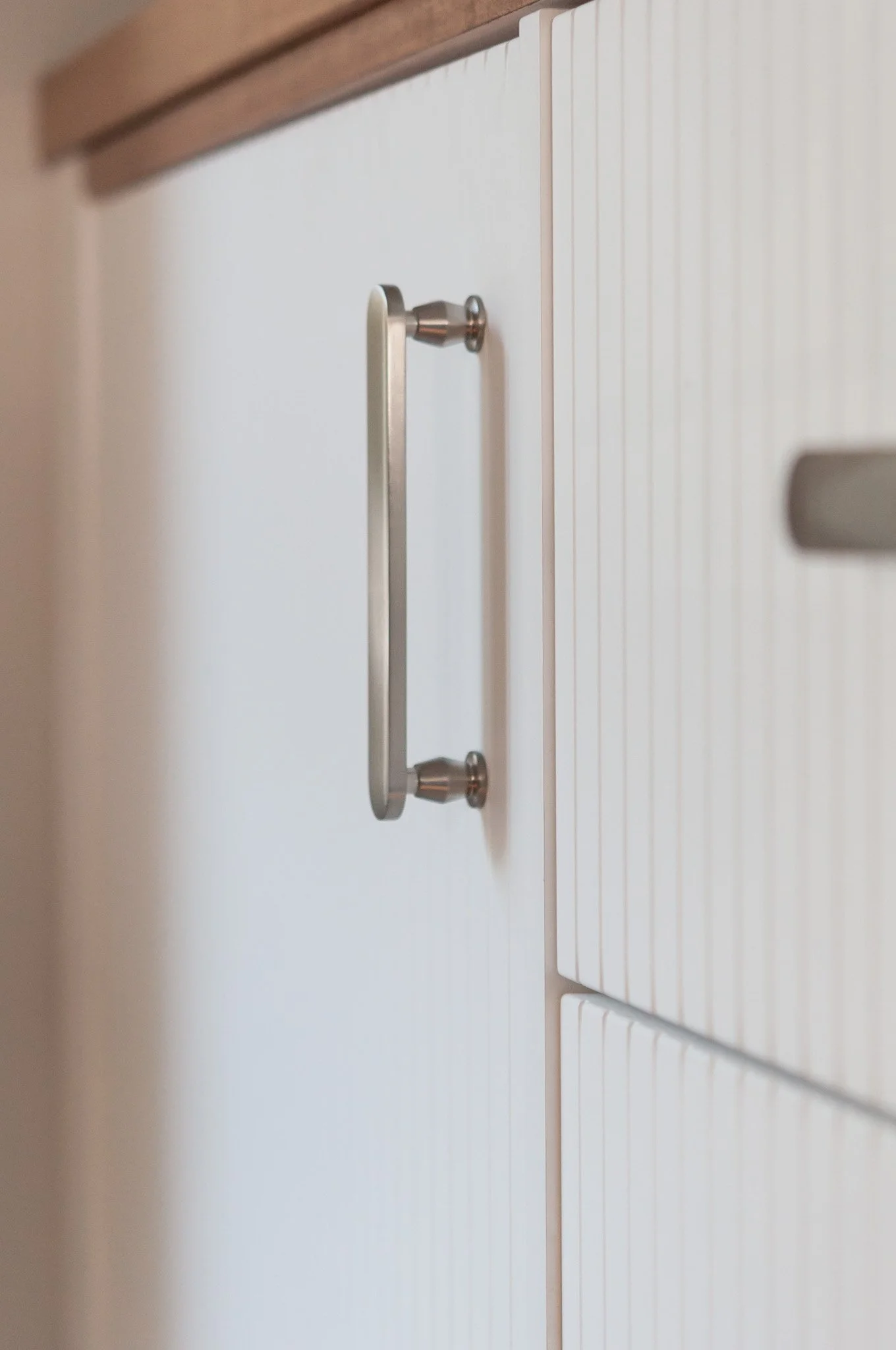
We chose a white deco fronts for additional texture, pairing them with sleek brushed nickel hardware that from the front mimics the texture of the cabinet doors, and also gives a little nod to the pill shaped tile in the bathroom upstairs. From the side they have extra detail that adds even more character.
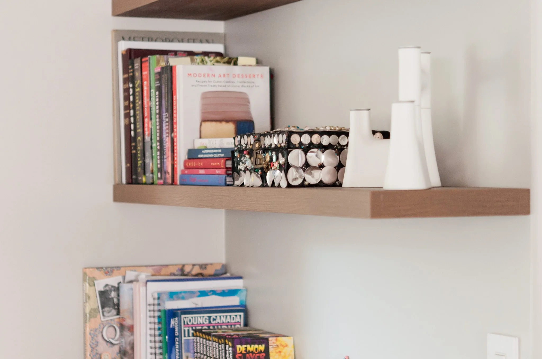
The floating shelves finish off this area with more display and storage space for books, art and decor.
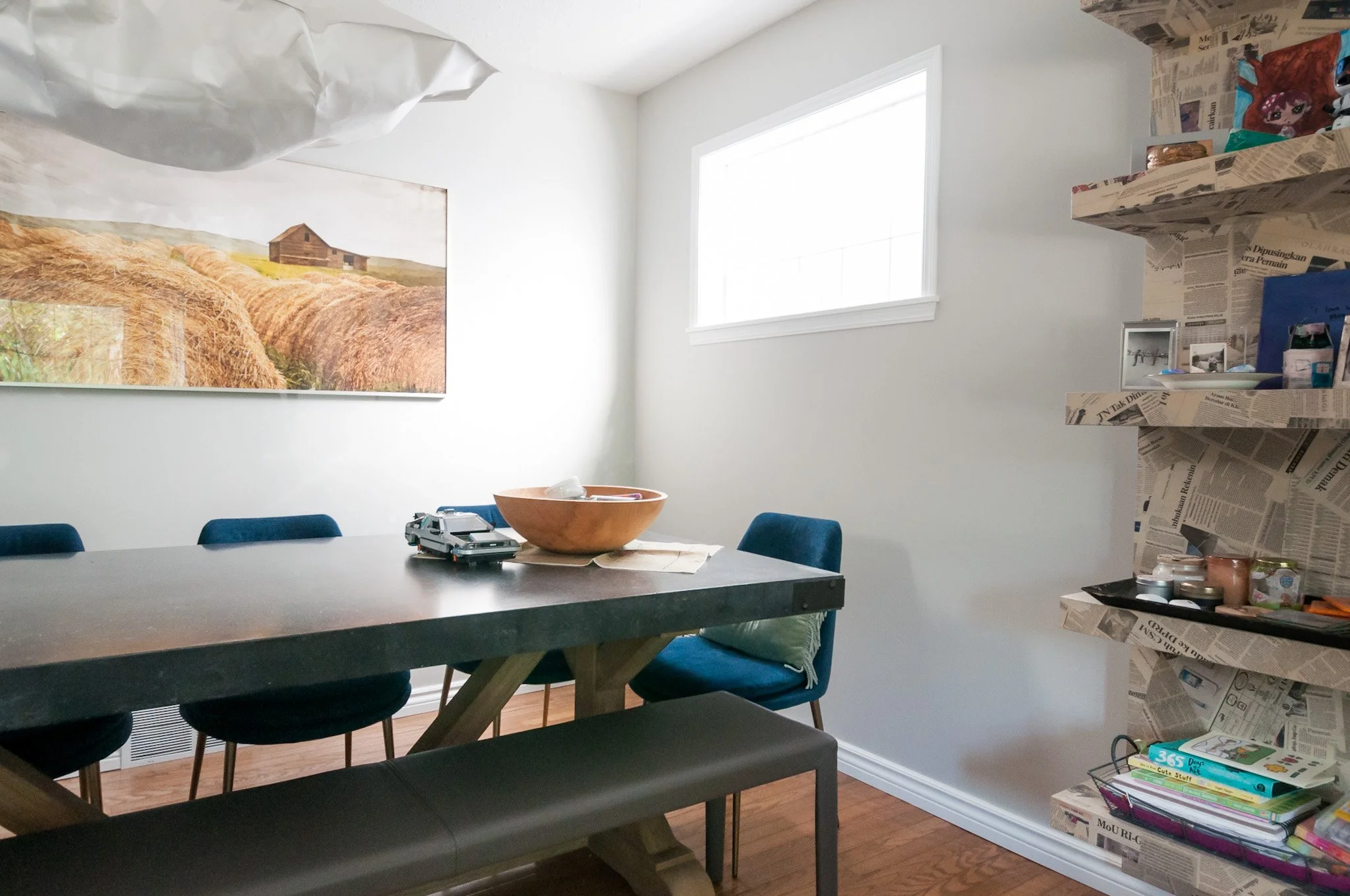
Over in the dining room, I really love the more eclectic feel that the blue velvet chairs bring to the space. They also make the artwork pop even more! And the leather bench blends seamlessly to open up the view and also to add another texture for visual interest.
The bathroom.
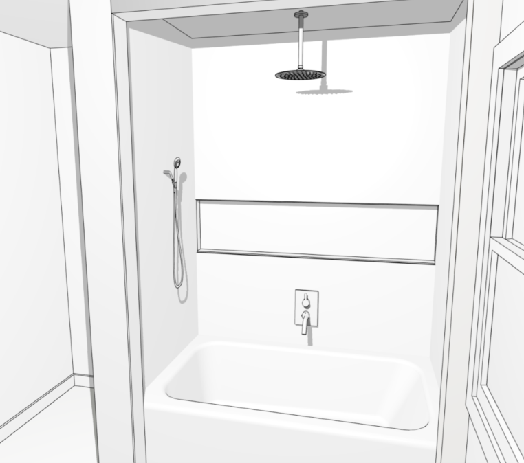
The tub and shower space turned out exactly as we had envisioned and has provided our clients with that more luxurious experience in their everyday lives.
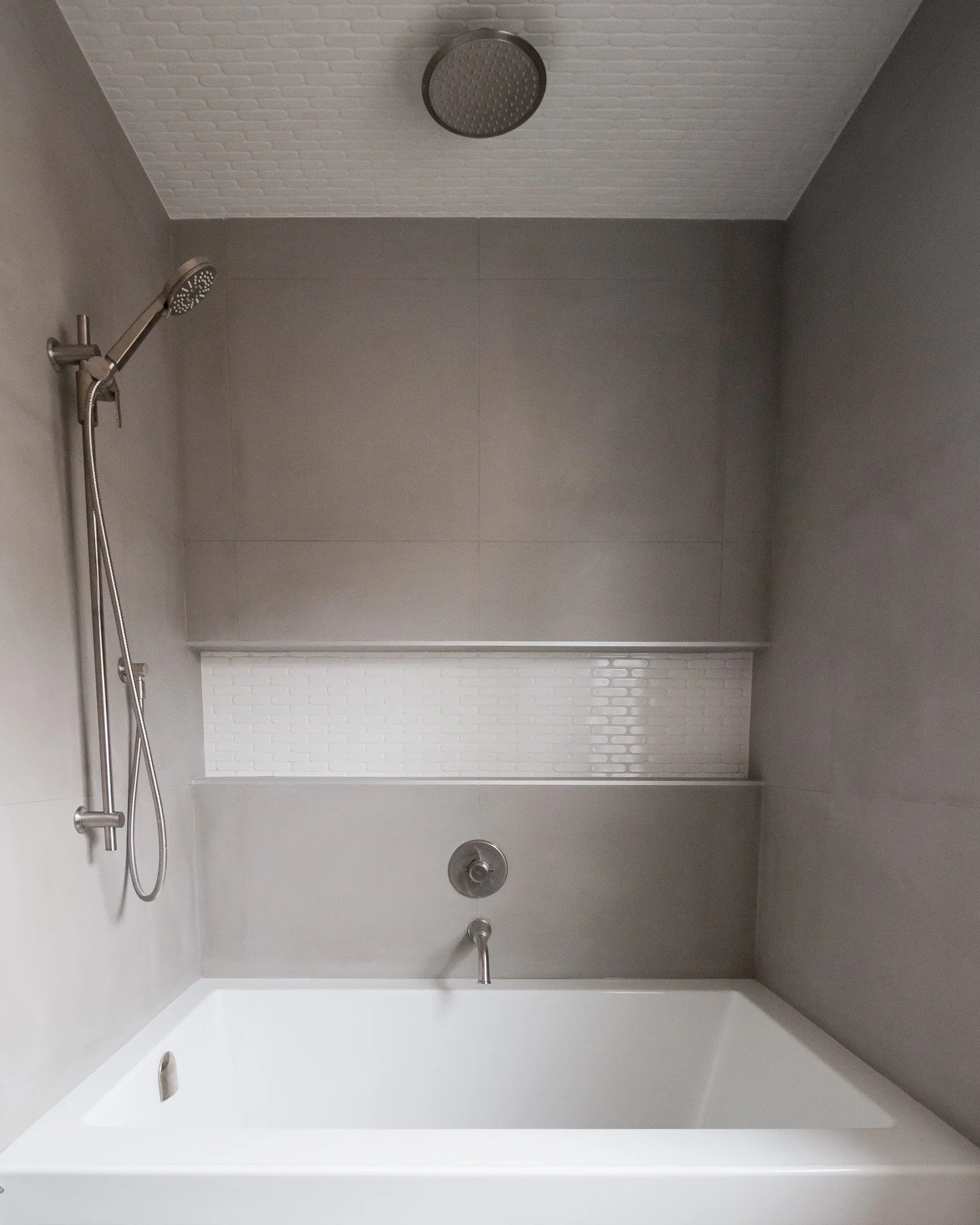
The niche is the showstopper of the space and provides ample storage for everyone’s shower items.
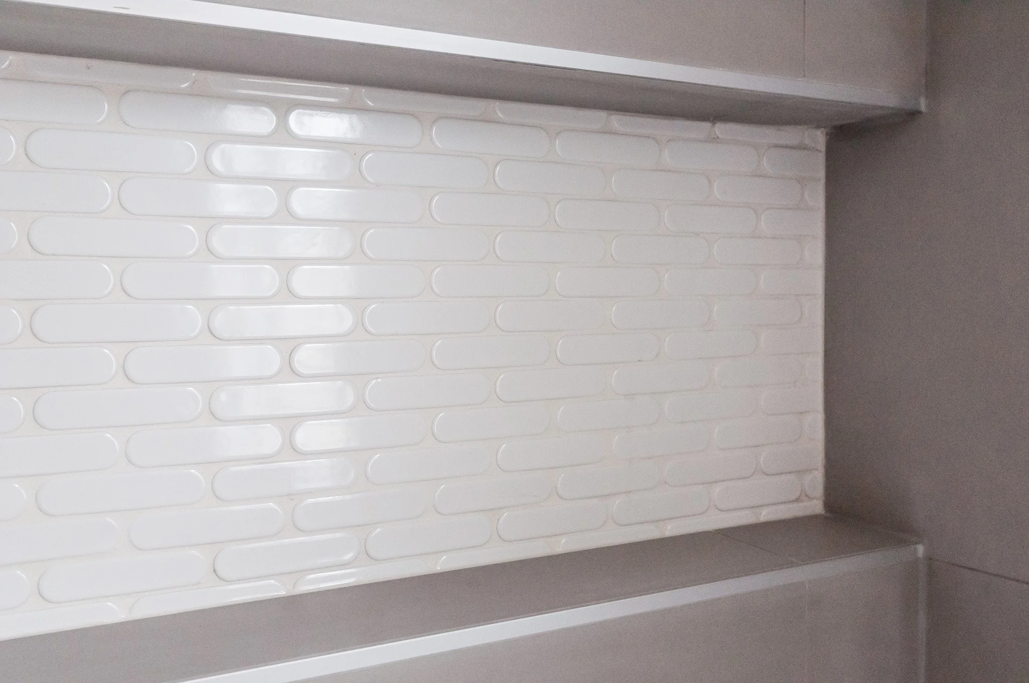
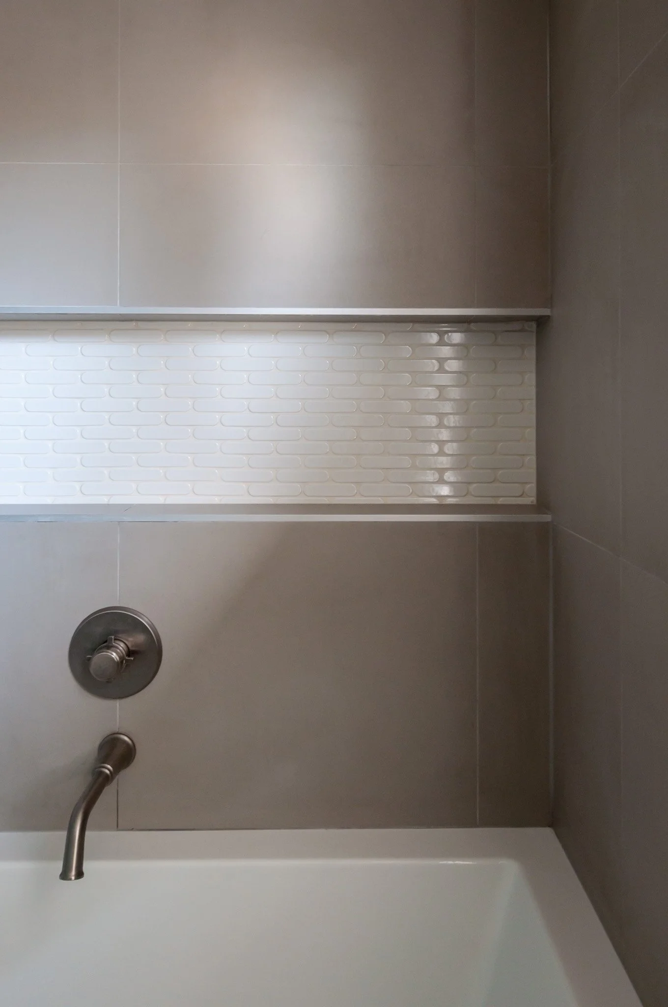
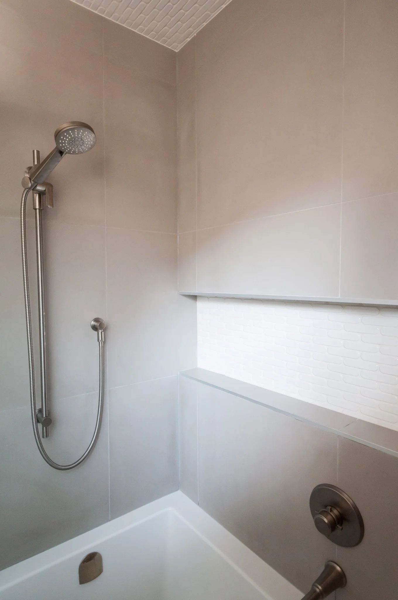
As you can see in the photos, the gray tile can actually feel a bit warm when the sunlight hits, and I find the shape of the accent tile has a comforting feel that ensures the space doesn’t feel too cold or sterile.

I love tiling the ceiling of a shower as it’s like this little added luxury and is so much more interesting to look at when you’re enjoying a warm bath!

We also replaced the previous backsplash behind the sinks with the pill tile to just further tie in the new portion of the bathroom with the old.
I think that this project is a great example of why sometimes all you need is an outside, professional opinion on the potential that already exists in your home. Whether it’s a smaller renovation like this one or potentially going as far as a full addition, there are almost always a few options for how your home can both function the way you need, and also feel the way you desire it to. We love being part of that process and helping you see your home in a new light, and are happy to chat about the possibilities for your home too – just reach out!