Oliver Condo Transformation
I get attached at some level to every space that I work on. But there is something about this particular condo that keeps me wanting more!

From the moment I got the first email from my then soon-to-be client, I knew this was a project I wanted to work on and a client I wanted to work with! There was so much potential in this space and I knew that together we could turn it into someplace special.
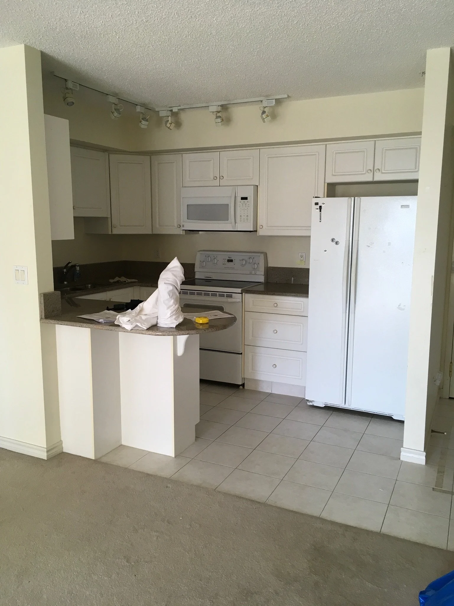
The building is from 1999 and it appeared that the unit was in near-original condition. So it was definitely time for a refresh! One of the recent changes was the newer granite countertops which we had to take out. And that breaks my heart, but they weren’t right. So it was definitely time for a refresh!
The design goals for the space were as follows:
Modernized space, bright with natural tones
Improved lighting throughout
Thoughtful updates to provide a good return on investment while ensuring the space still felt like a home.
Spare room that functions for guests
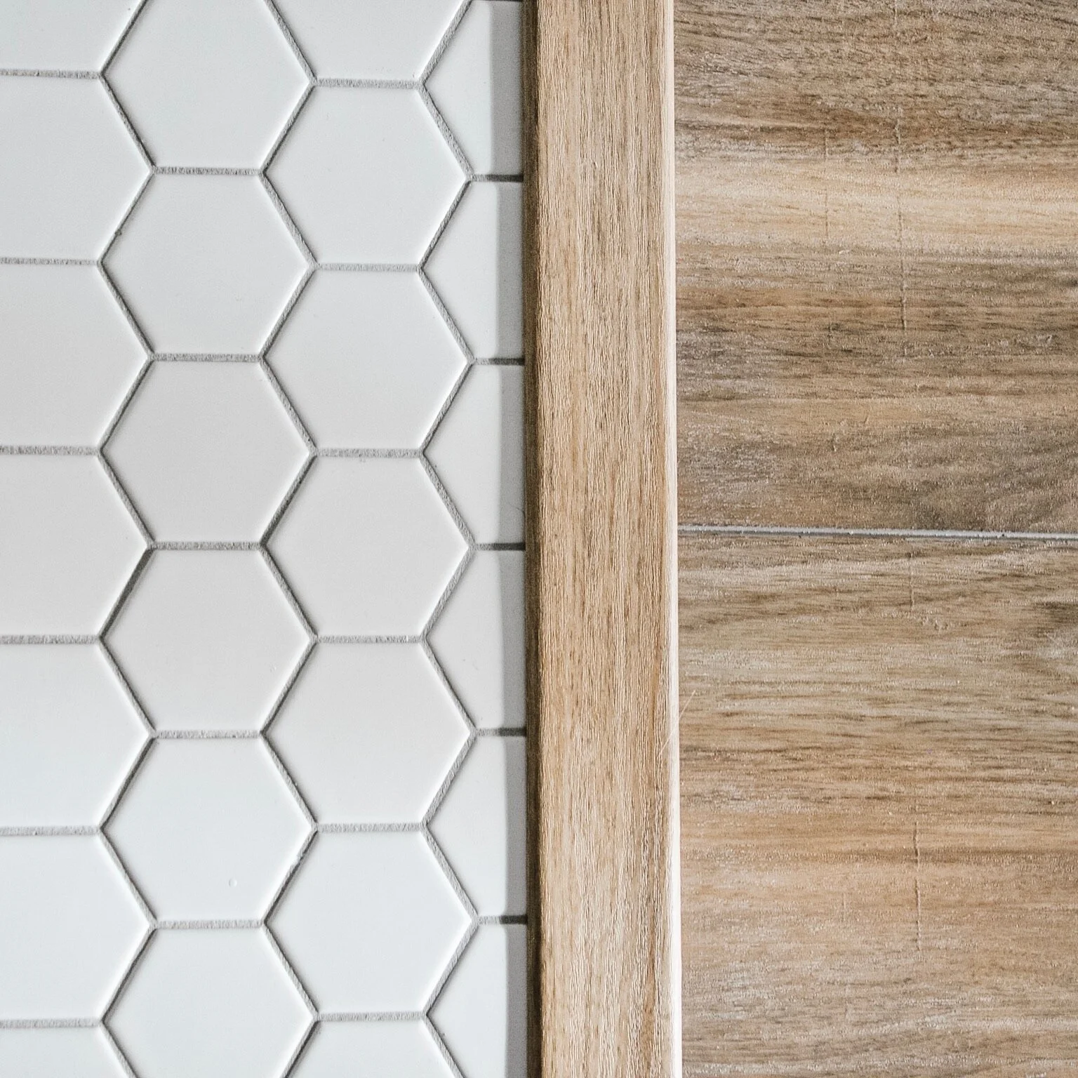
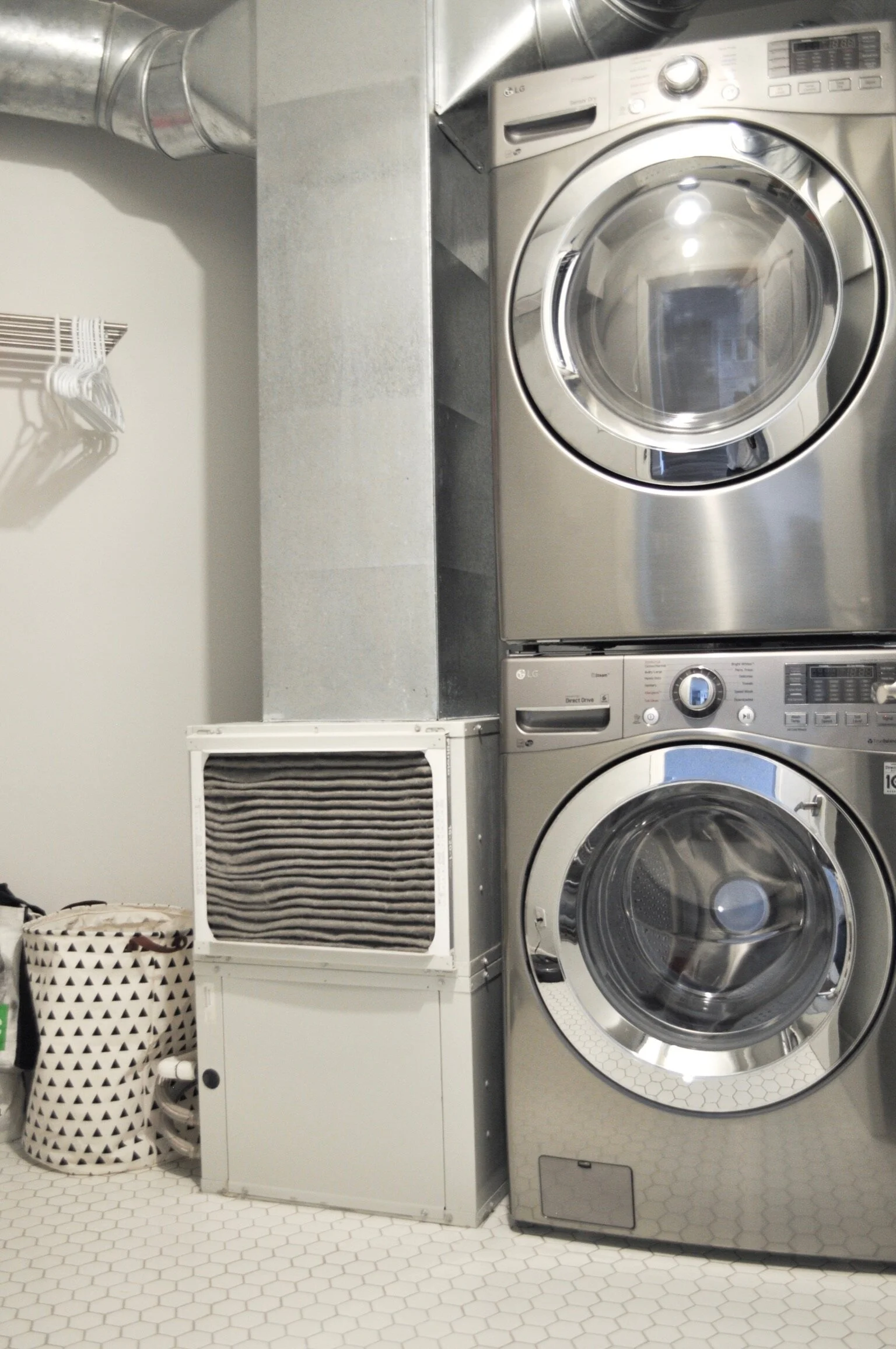
A fresh coat of paint and new flooring throughout were the major portions of the renovation. The change to hard flooring throughout immediately made the home look larger. We chose to go with a neutral wood tone vinyl plank in the bedrooms, living areas and kitchen. In the bathrooms and laundry room we opted for a white 2” hexagon tile.
Note: the before photos are a combination of my own photos from the initial walk through and the client’s photos from the initial viewing.


Kitchen
To gut, or not to gut? In this case we chose not to gut. The cabinetry was still in good condition and new cabinetry wouldn’t have added much value for the investment. So instead, we gave it a refresh and made a modification to the peninsula.
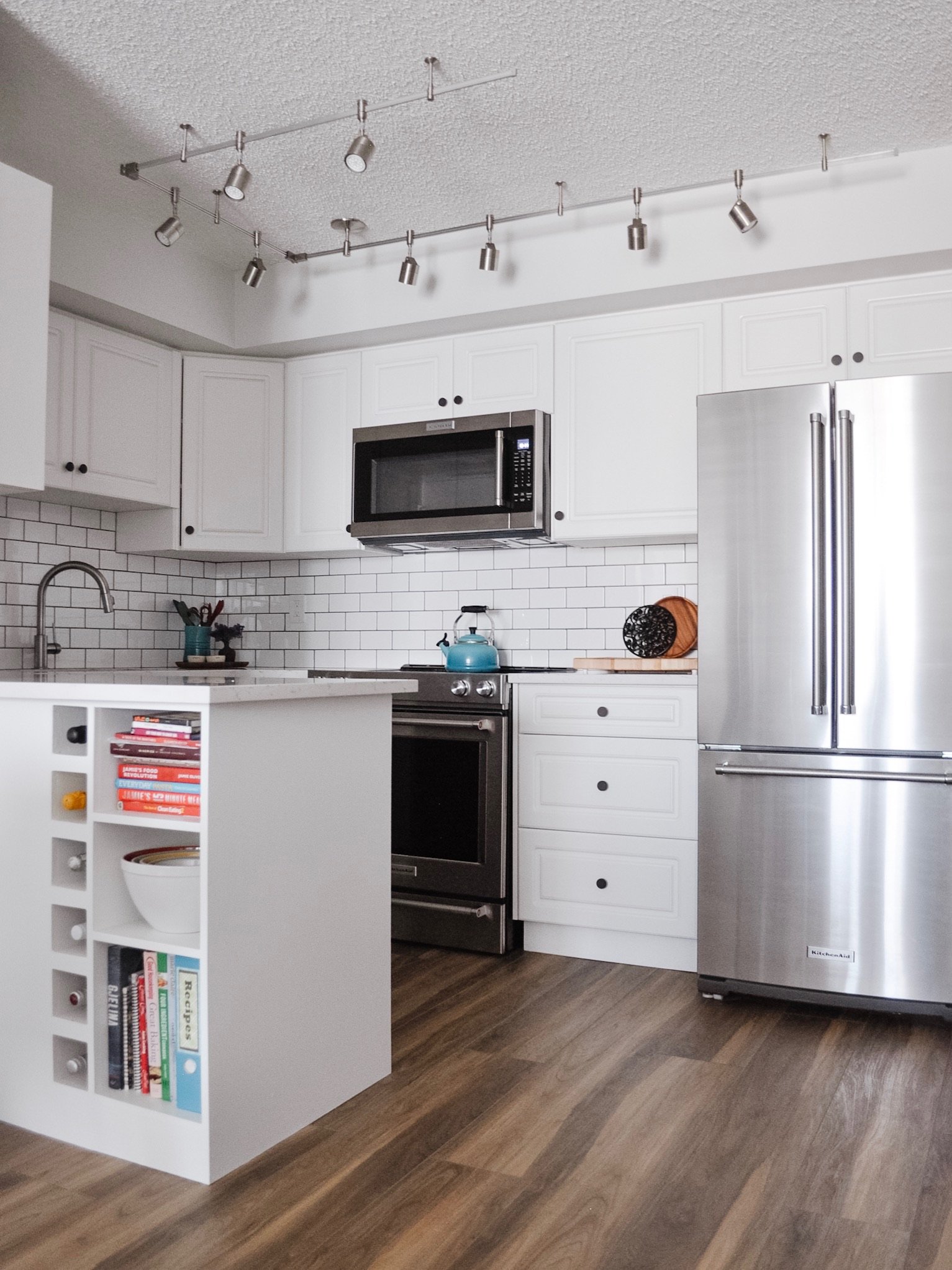
The original peninsula looked dated and resulted in some wasted space. It wasn’t big enough to use for seating, so we decided to add to it with a custom designed piece to attach to the existing cabinetry. This gained a 6 bottle wine rack and 3 extra shelves. We also squared off the peninsula for a more modern feel.

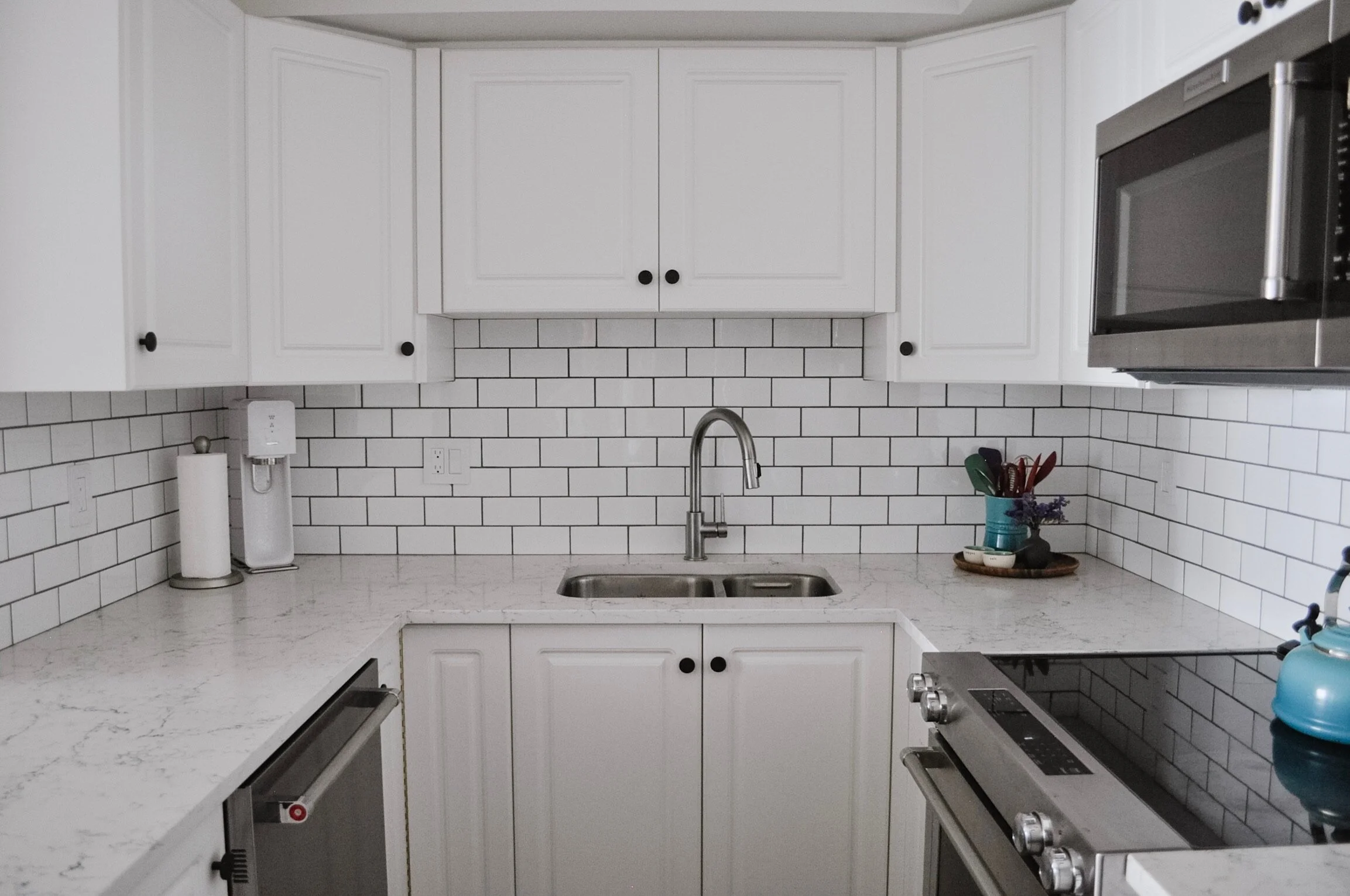
As mentioned, the existing countertops were “new” but they also felt dated due to the colour and profile chosen. I hate having to take out something that is new, but it wasn’t going to work any other way. We replaced them with Caesarstone’s White Attica quartz and put in a proper backsplash to complement it.
New appliances, new knobs, a new faucet and more (new) lighting finished off the space.
I very rarely specify track lighting but in this case, since the building is concrete, we didn’t have enough space to add recessed lighting. But if you have to do a track, do a nice, airy feeling track like this one! We also went from 6 lights to 8 (and made the jump to LED). This helps to give more light to the space, which is lacking when it comes to artificial light.
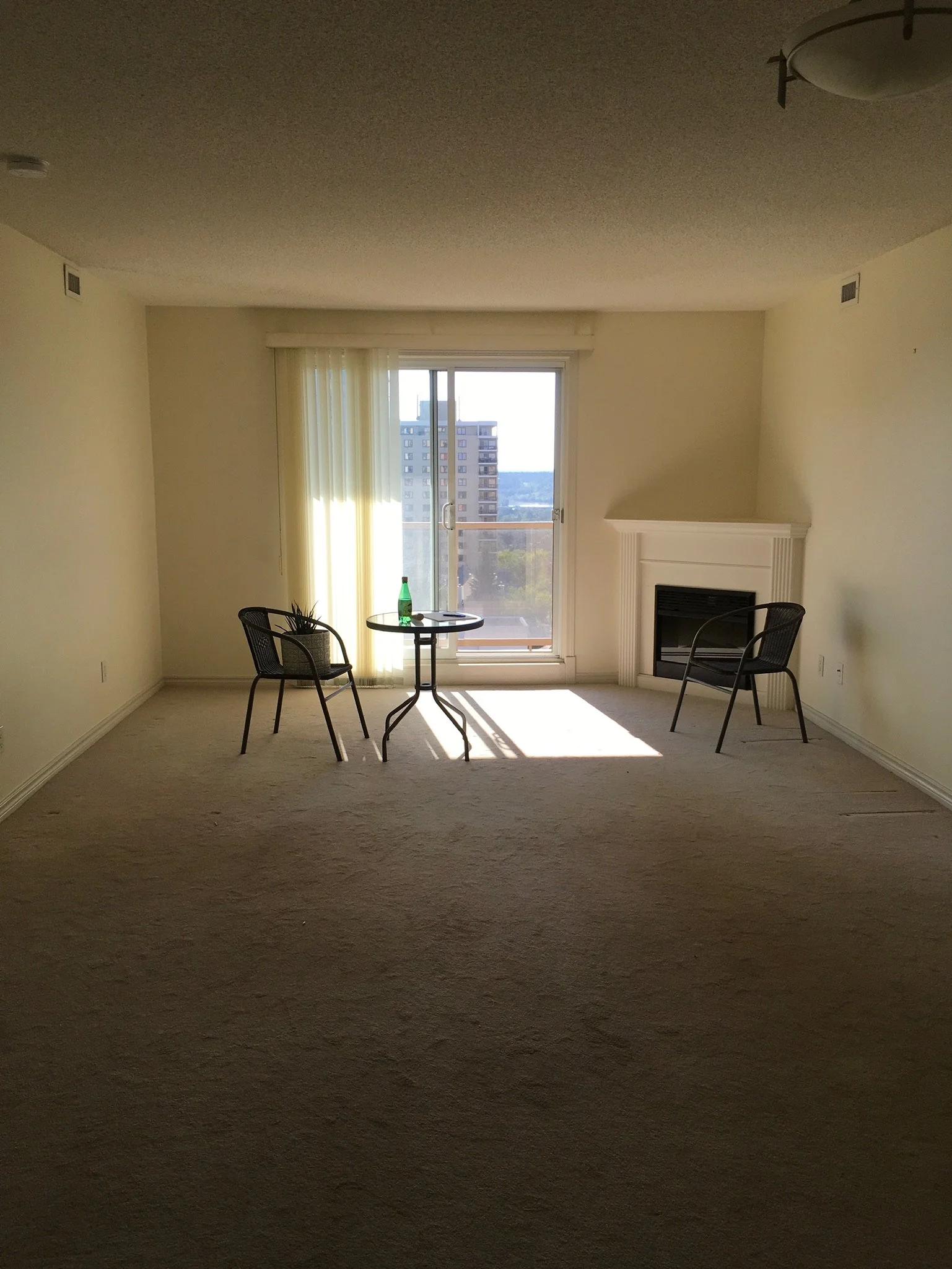
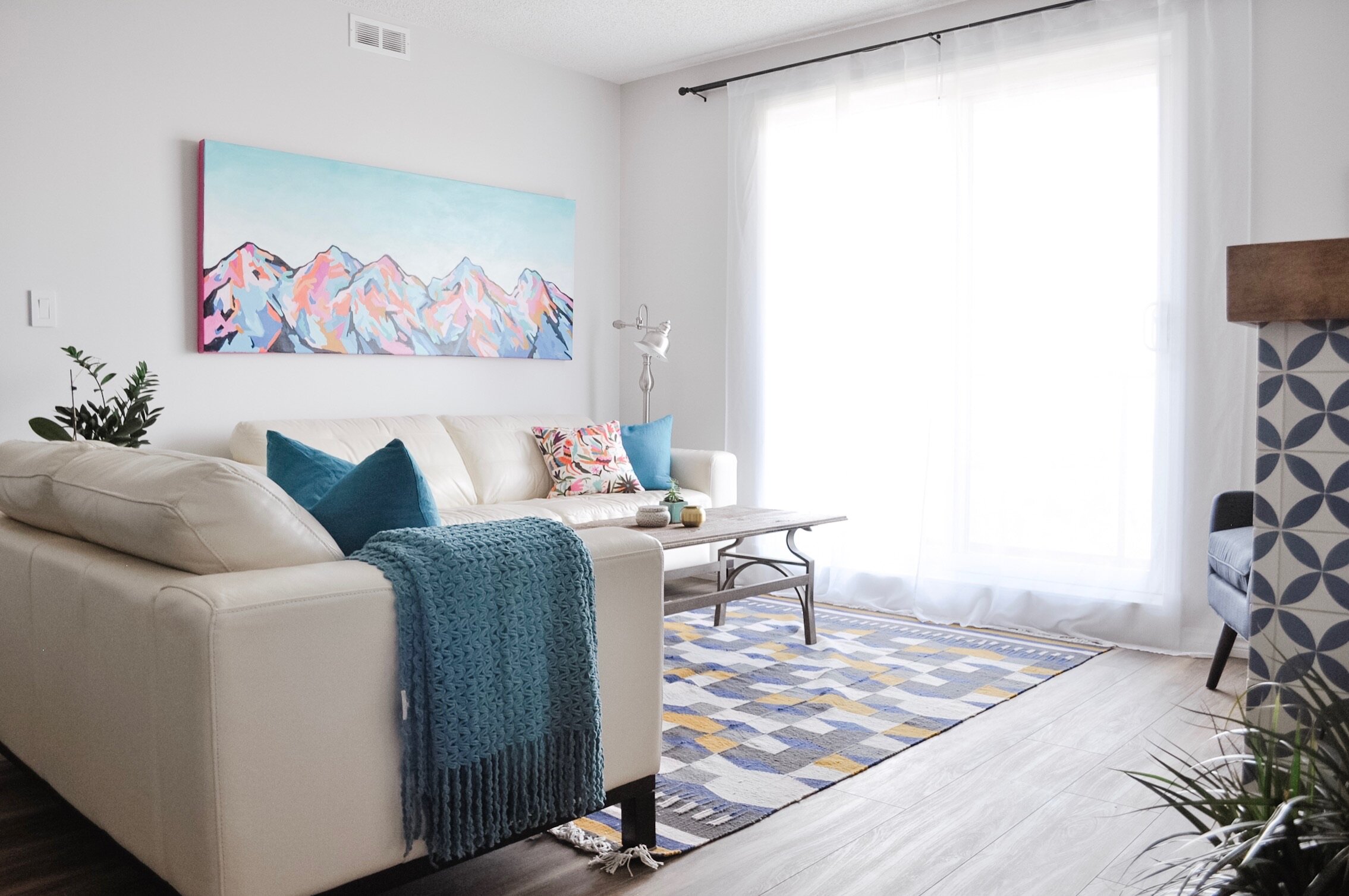
Living Room / Dining Room
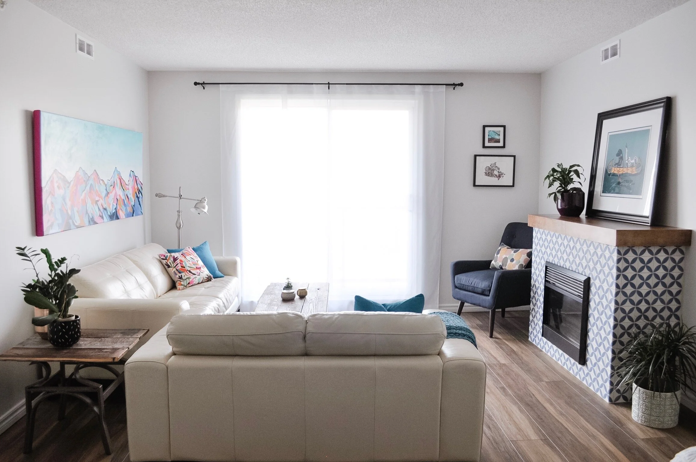
I can’t even begin to tell you how different it is to walk into this space. The images tell you a lot but the feeling - the feeling is everything. This space welcomes you and makes you smile.

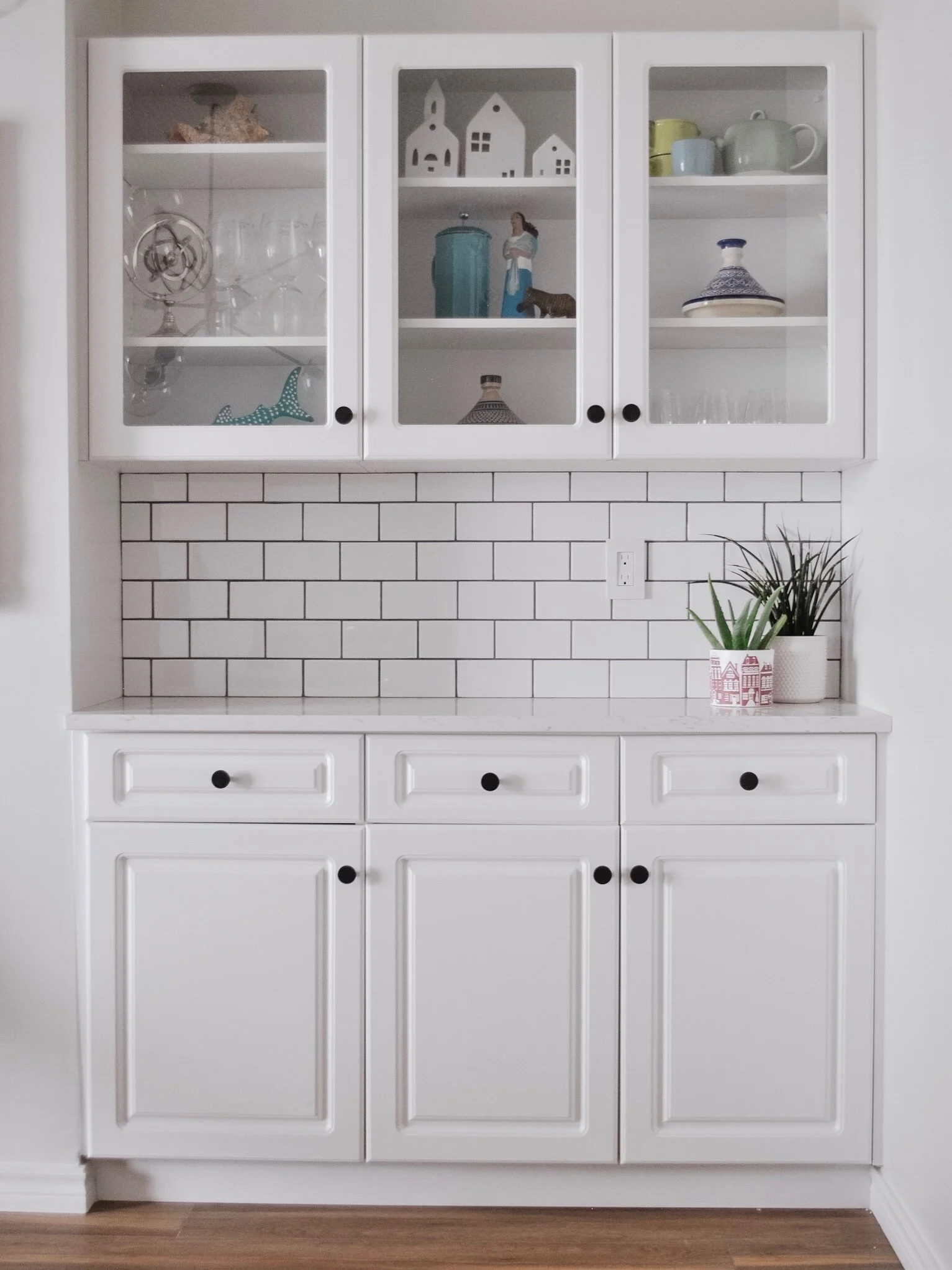
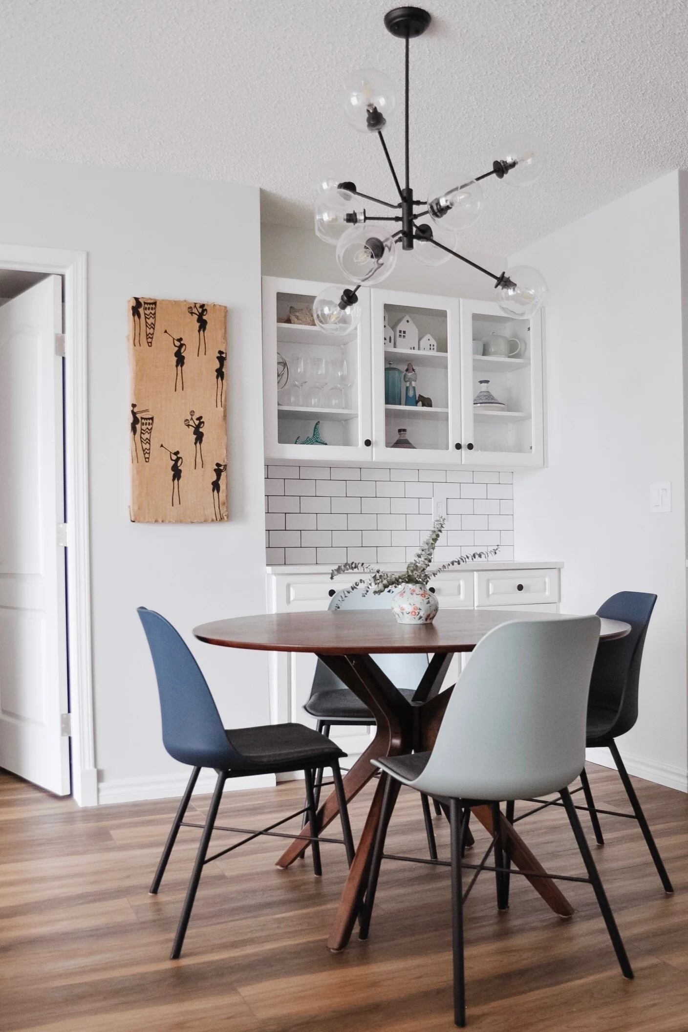
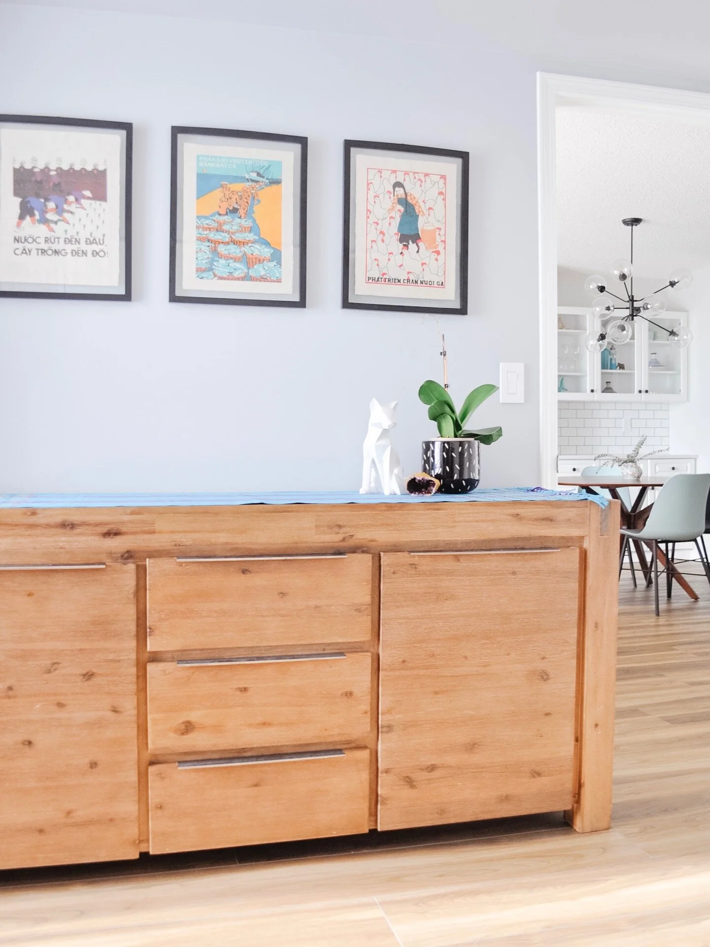
We kept the built in cabinetry in the dining room and updated it to match the kitchen. The glass doors are perfect for displaying interesting and colourful objects!
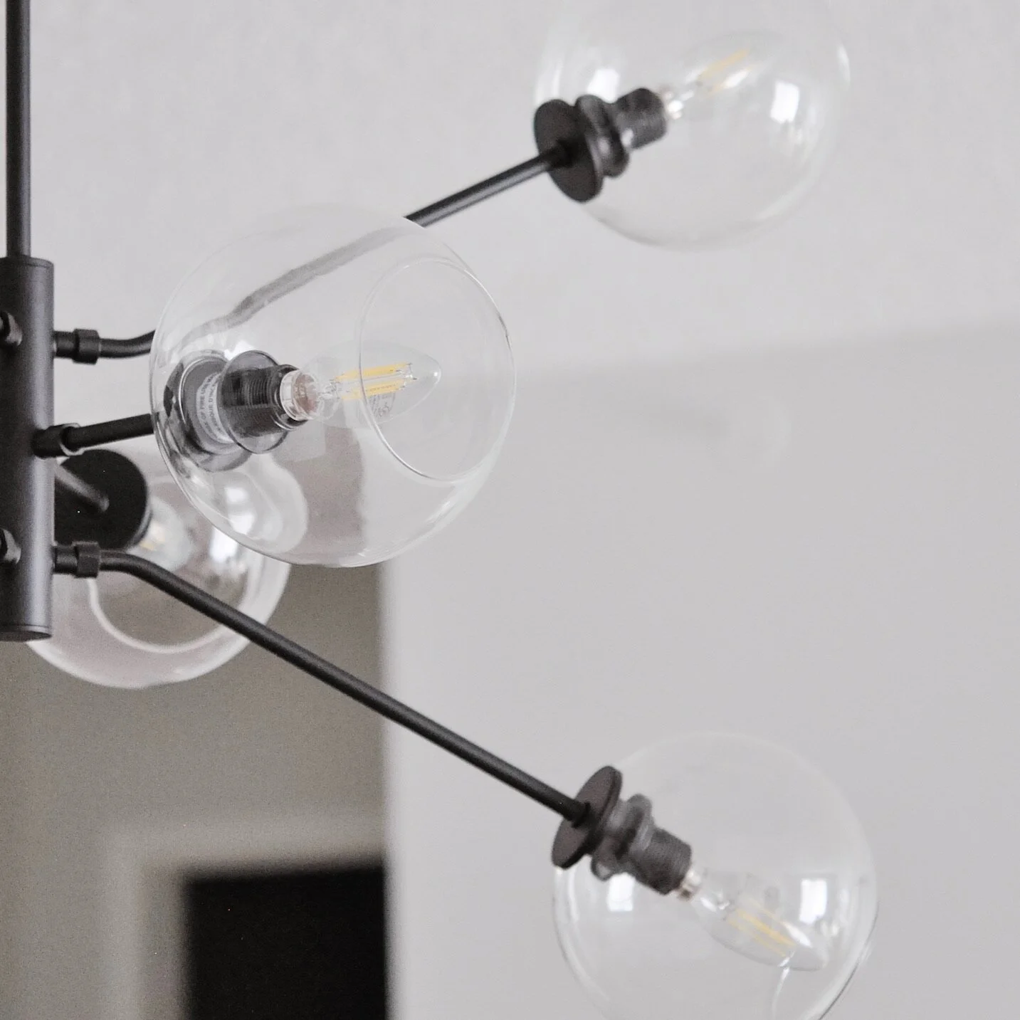
The dining room light fixture was also replaced with the Atom Pendant, increasing light to the space. More bulbs and clear glass was important for the living room to benefit from this light fixture too.
We chose a round table because it fit the space so well and ensured easy pathways through the space. And what happens when you can’t decide on what colour of chair to get - well you get both!

The living room had a corner fireplace that made good furniture layouts difficult. When we actually looked closer at the fireplace it became clear that it would be easy to relocate. So that’s what we did.
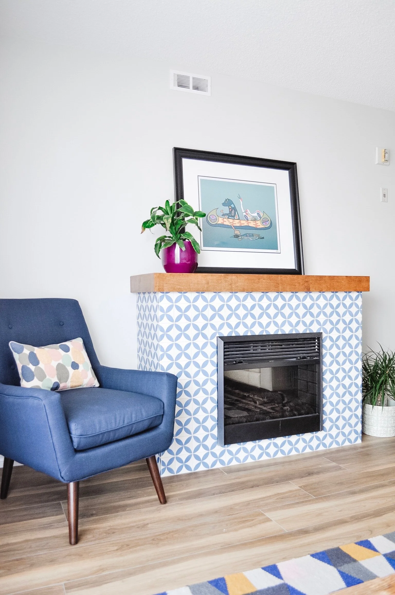
The fireplace tile is a custom made cement tile. It took over 4 months to arrive - which was the same amount of time we spent on the bulk of the renovation! Was it worth it? Hell yeah.
The fireplace mantle was custom made to fit as well. It finishes the space so well and brings in warmth.
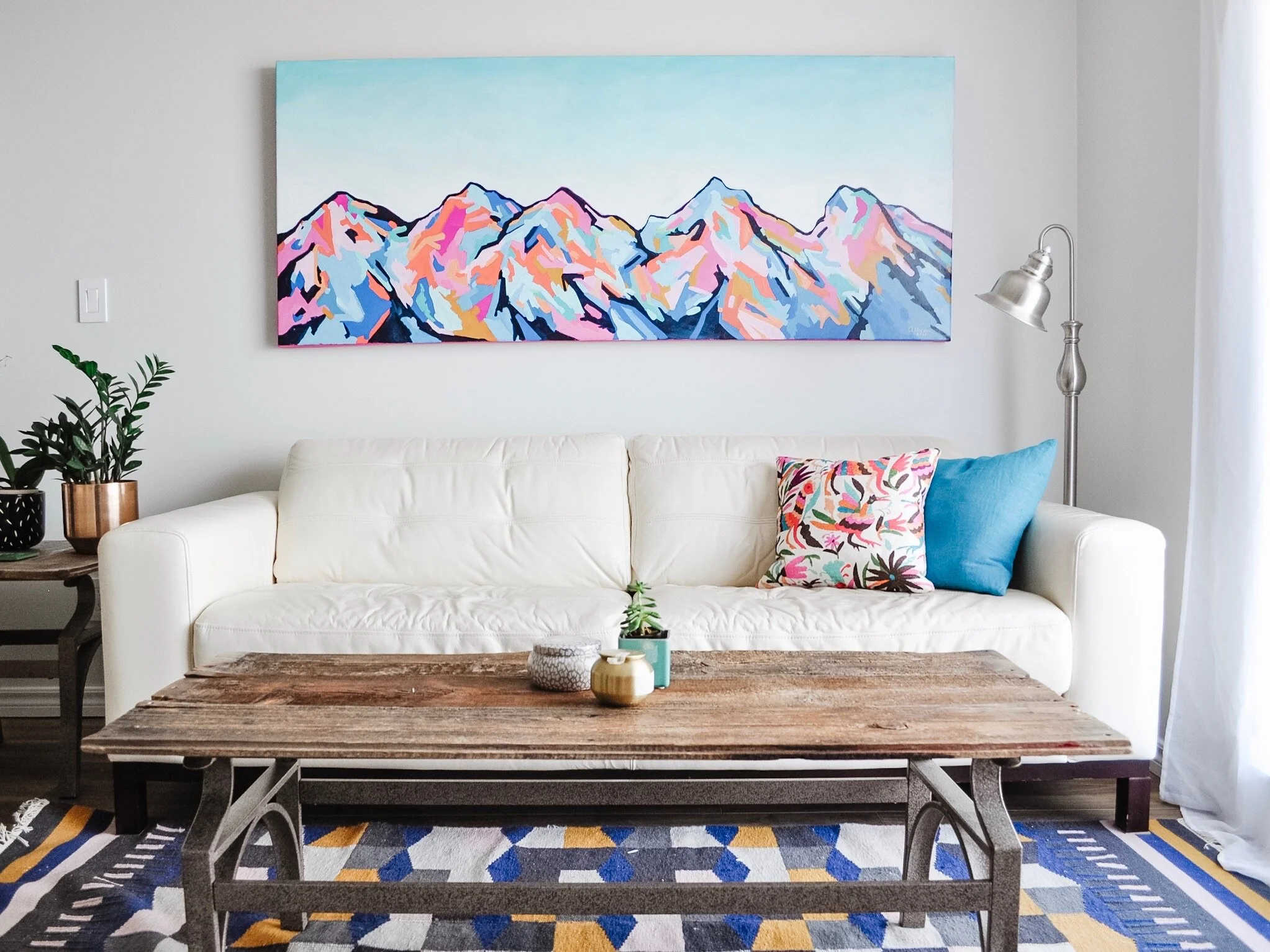
The last piece of the design puzzle was another custom piece. This time a commissioned piece of art by the incredible Edmonton based artist Amy Dixon. The day we hung it, it was like the entire space was magically complete.
Guest Room and Ensuite
The guest room (or 2nd bedroom) came with a murphy bed that we decided to keep. We knew we could make it even better and it allows the space to function as a guest room as well as the potential for an office. On its own it felt a bit awkward in the space so we beefed it up with two custom shelves and painted it all white. The use of clip lights on the shelves allows for bed time reading without the need for nightstands.


A dresser and bench round out the space creating storage and a beautiful spot to sit and enjoy the great view from the window.

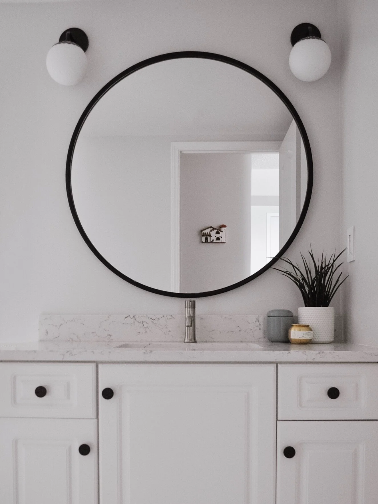
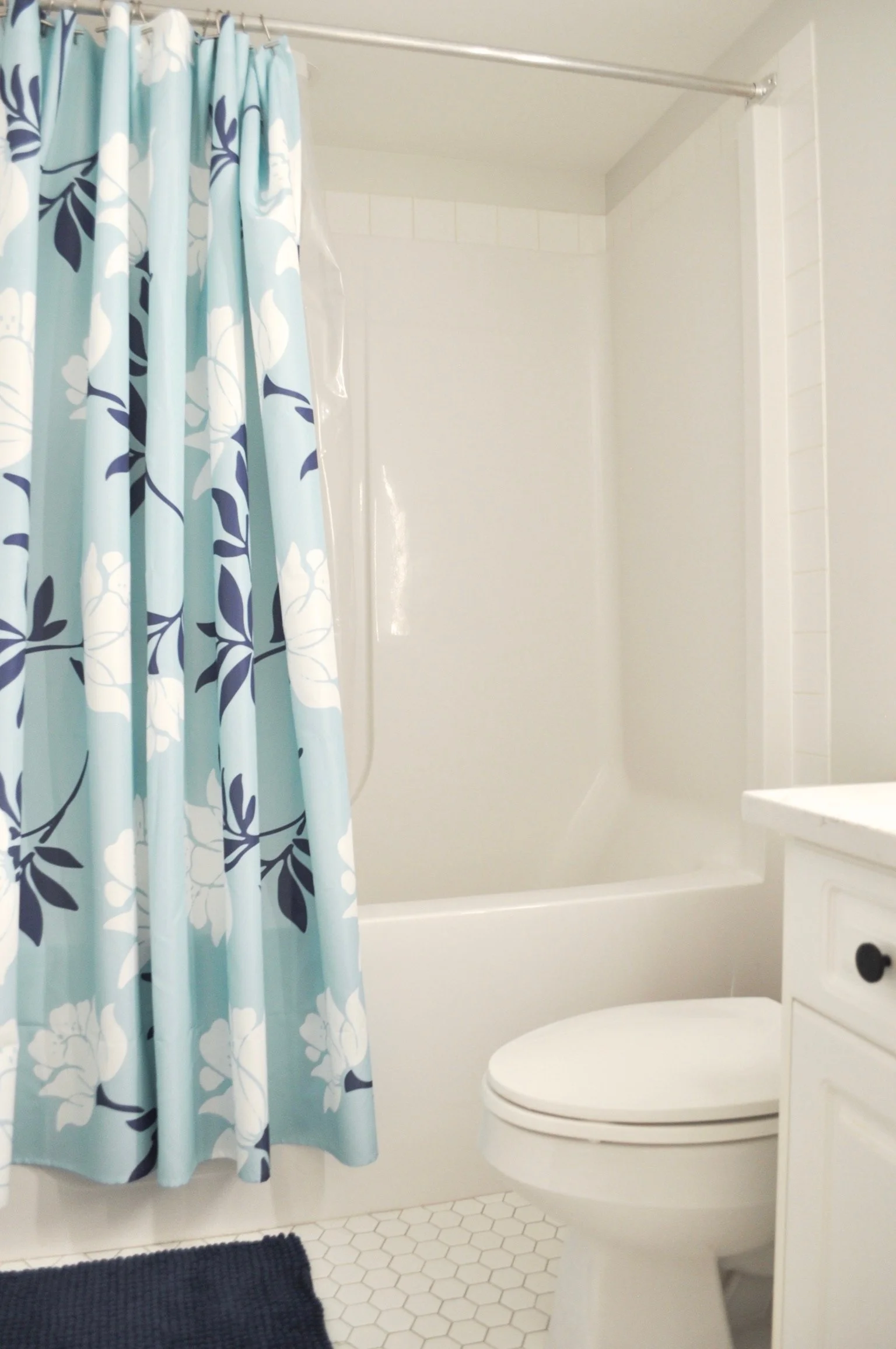
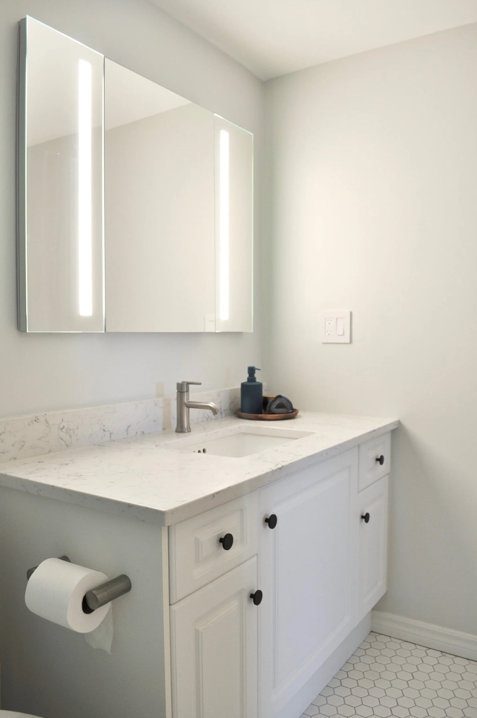
The bathroom connected to the guest room (and the main area of the house) was refreshed with new lighting, flooring, countertops, sink, faucet, mirror and hardware.

The bathrooms had a dropped ceiling so we were able to utilize recessed lighting. We removed the centred vanity light and added two sconces. This change added so much character and elegance.

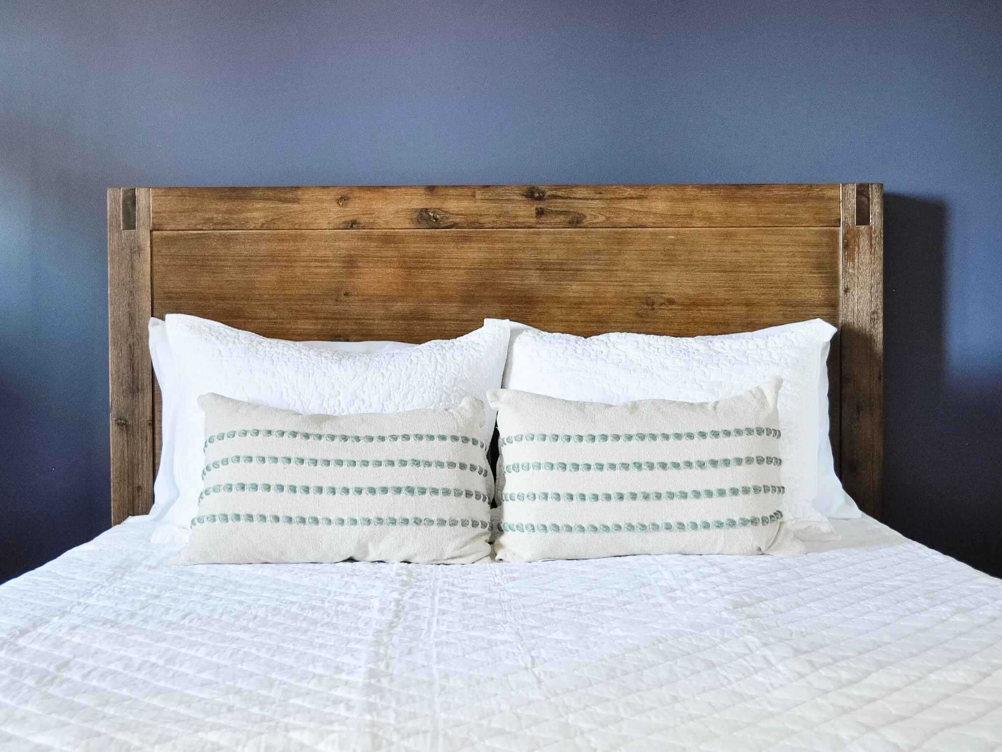
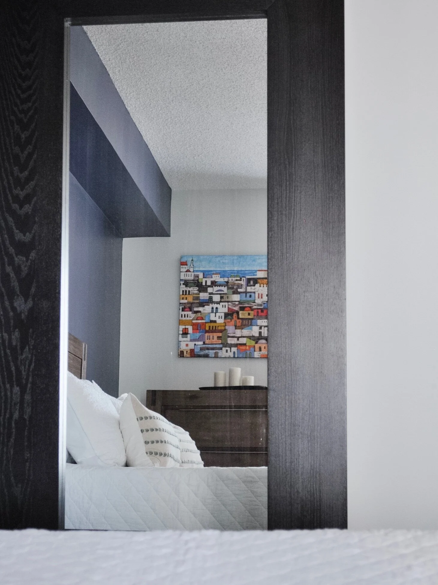
Master Bedroom and Ensuite
This space didn’t have much that needed to change but it did need a little something to add some visual interest. So we chose to do a feature wall in a deep blue to draw the eye in and to feature the wood bed frame.


In the master ensuite the design was like the guest bathroom. We got rid of the banjo countertop and full mirror which modernized the space.
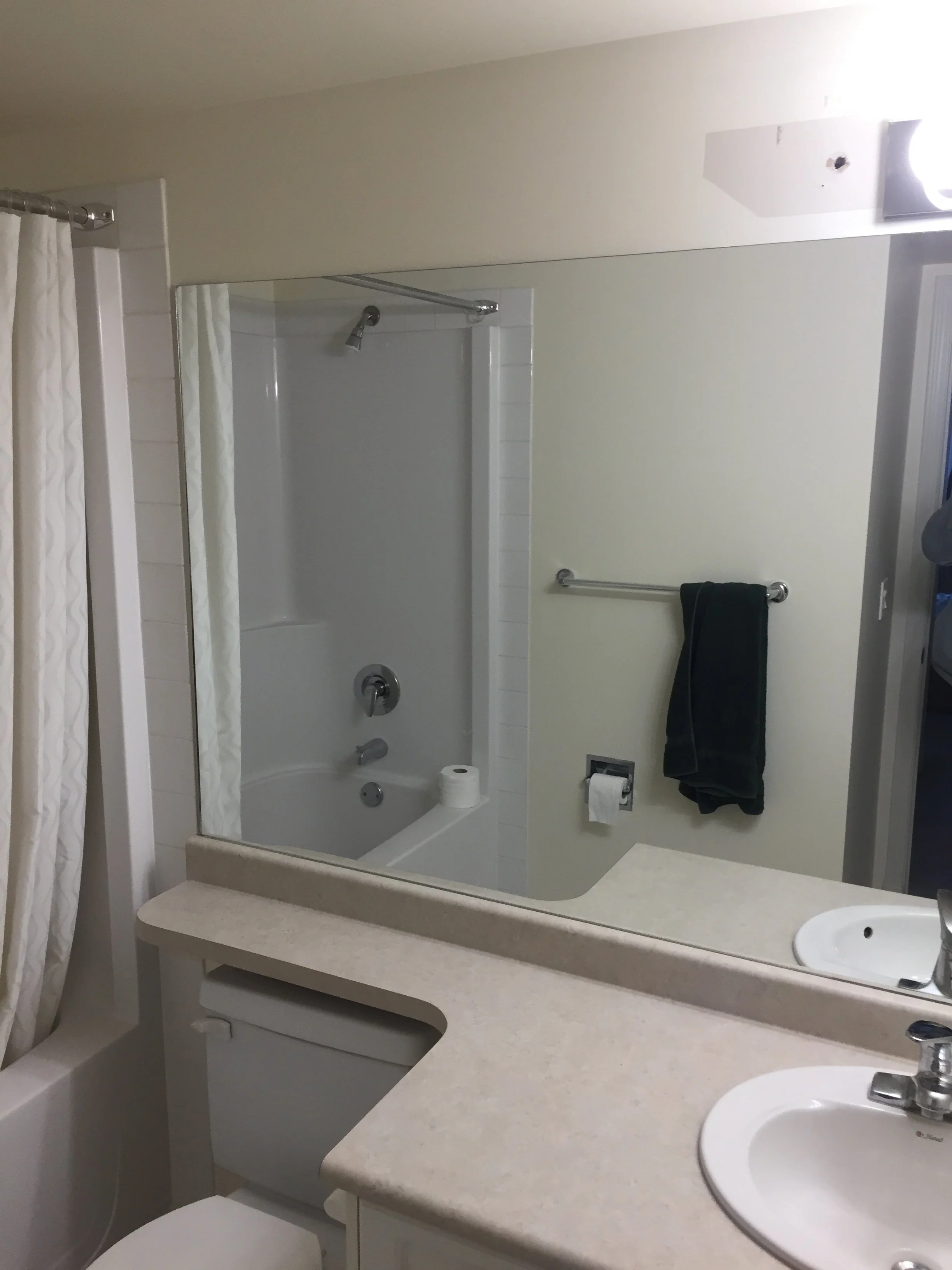
We added recessed lighting again but then upped the bathroom’s game by adding a backlit vanity mirror. We discussed a standard backlit mirror in this space but the client wanted extra storage. So we found this beauty of a medicine cabinet that combined everything she wanted. It was a bit of an adventure getting it to the condo and also getting it installed. But that’s a story for another day!

Laundry Room
Last but not least, we had to give the laundry room a bit of an update too. New paint, new flooring and a new washer / dryer was all it needed!
So what do you think? Are you feeling how special this condo is? Inspired to start your own transformation?
Sources
Lighting:
Furniture & Decor:
Kierstin Smyth Design
Edmonton Interior Design Consultant