Larkspur Kitchen Refresh
Do we love a good full gut renovation on a kitchen? Of course we do! But not every kitchen needs to be go through a total overhaul. Sometimes the bones of the kitchen work just fine and that was the case for our interior design clients in Edmonton’s Larkspur neighbourhood. When they moved into this home in 2021, they knew they wanted to update several aspects of the home. We ended up splitting this project into 3 phases that included painting the entire home, then updating the kitchen, powder room and lighting, and the last (and future) phase is updating the flooring! It’s also beneficial to work with a designer when you are going to phase your renovation plans because we can create the overall plan for the home and help you determine the best way to split up the work to optimize costs and reduce rework.
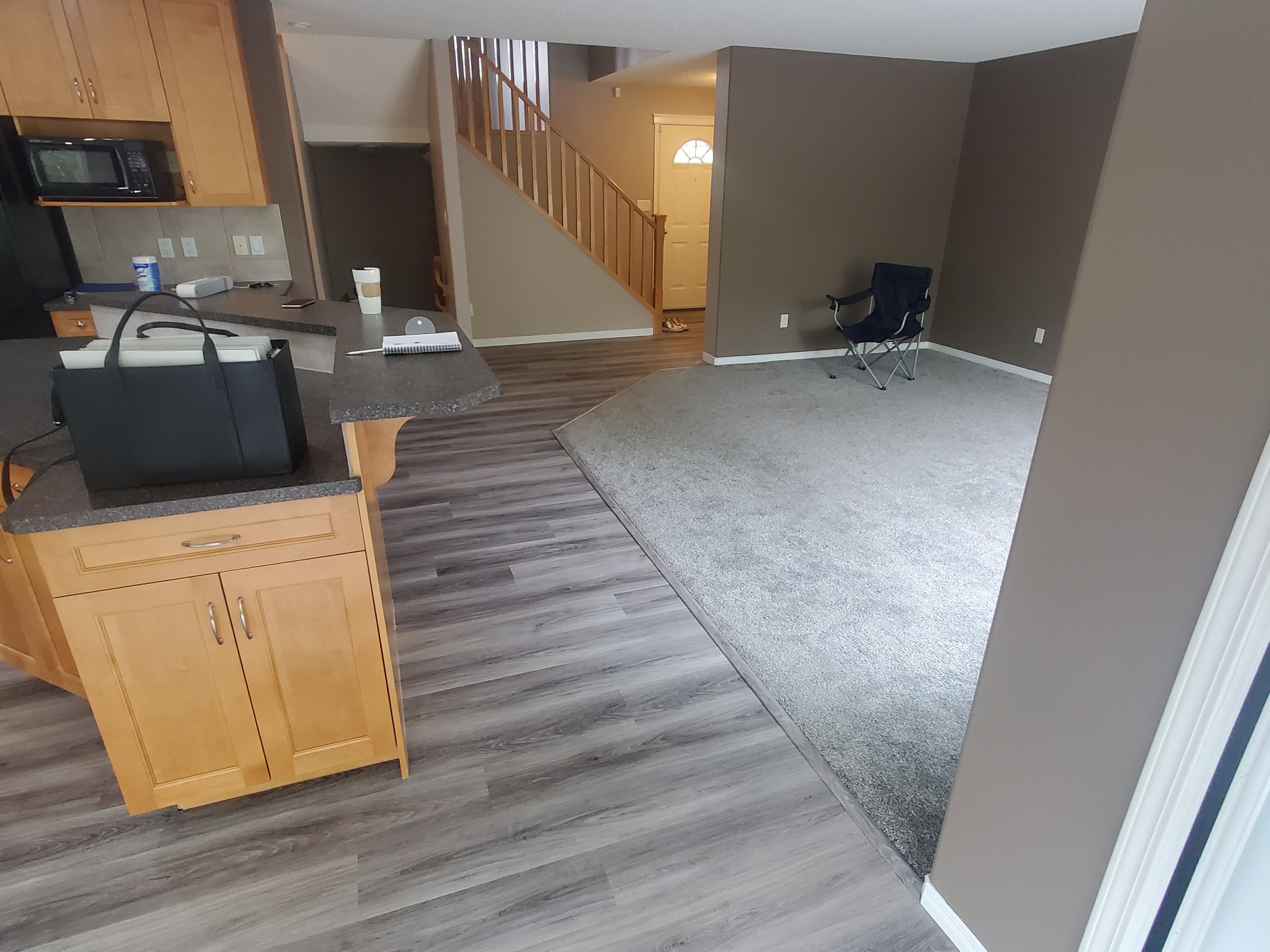
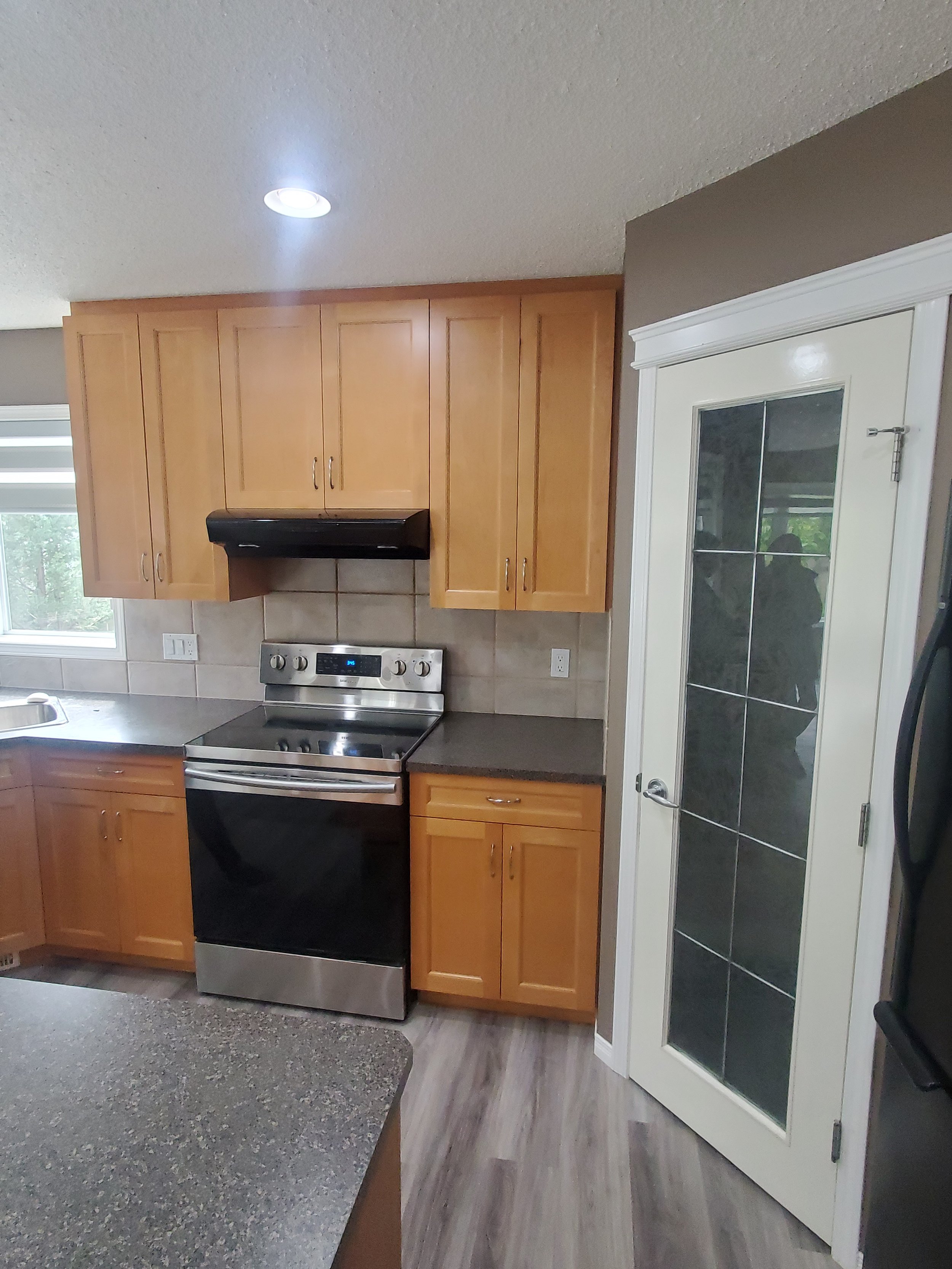
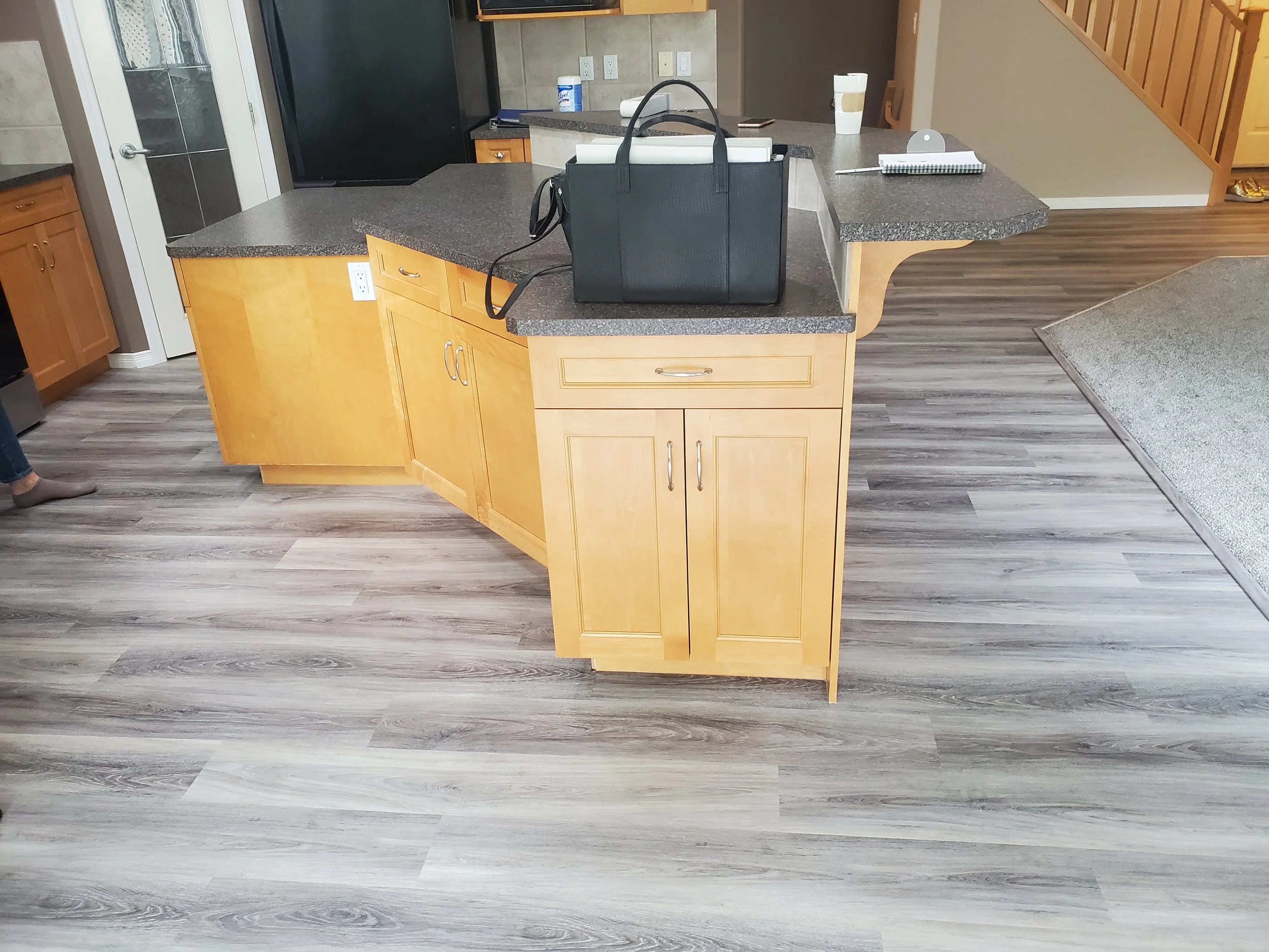
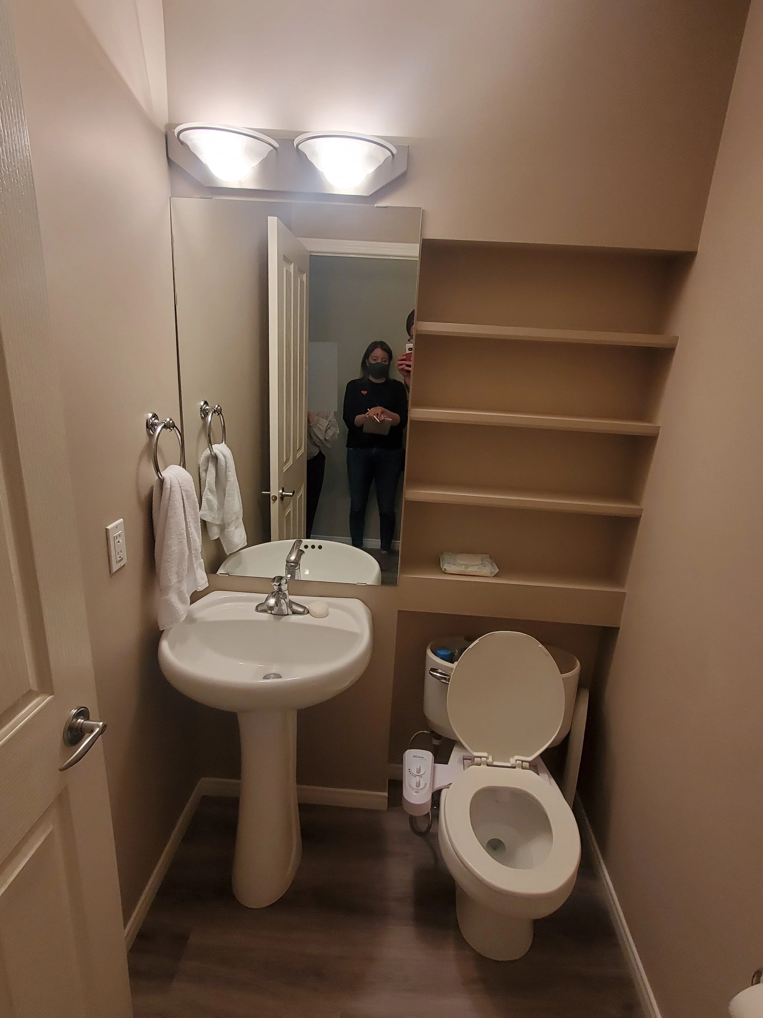
The Existing Space
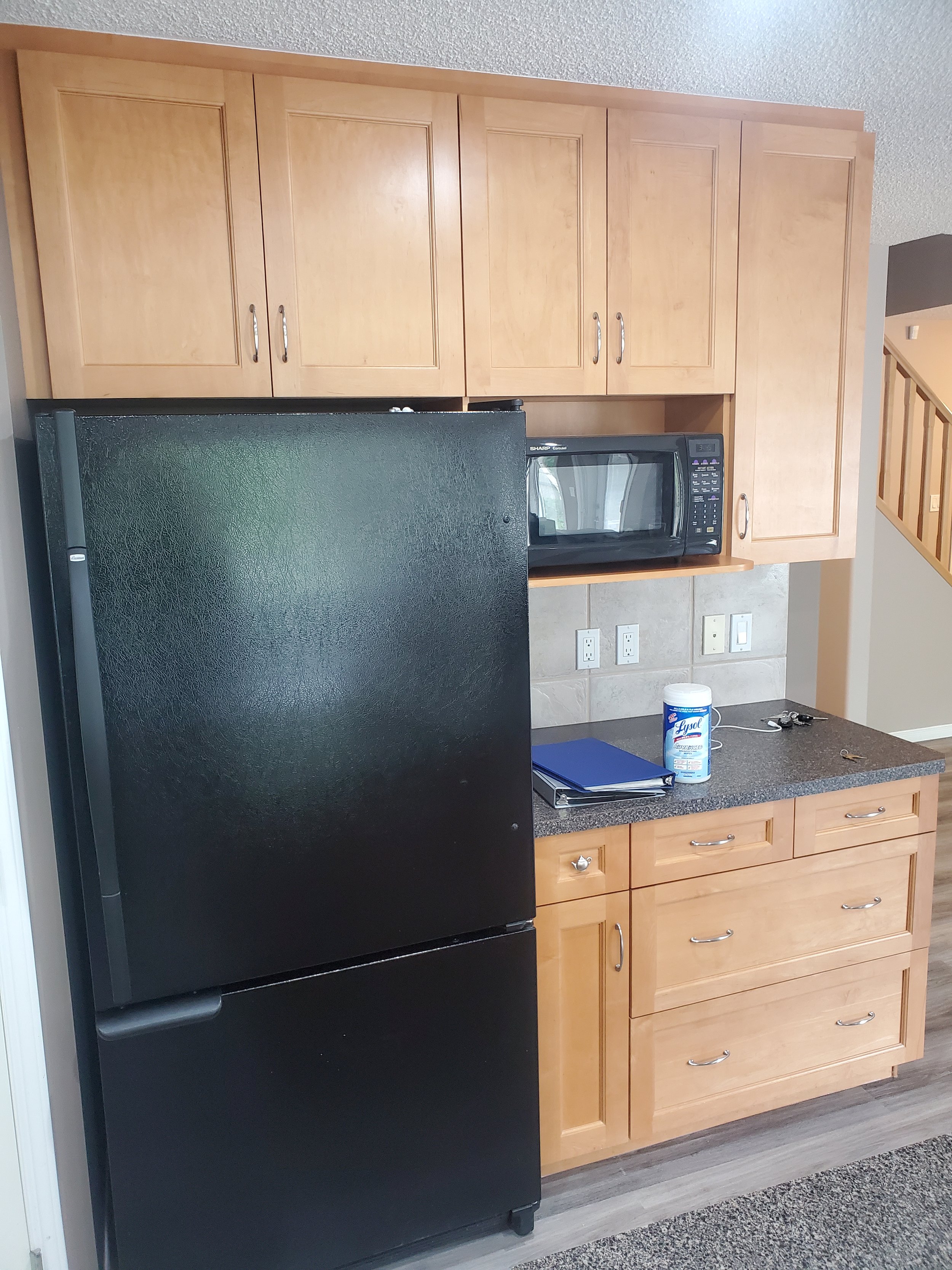
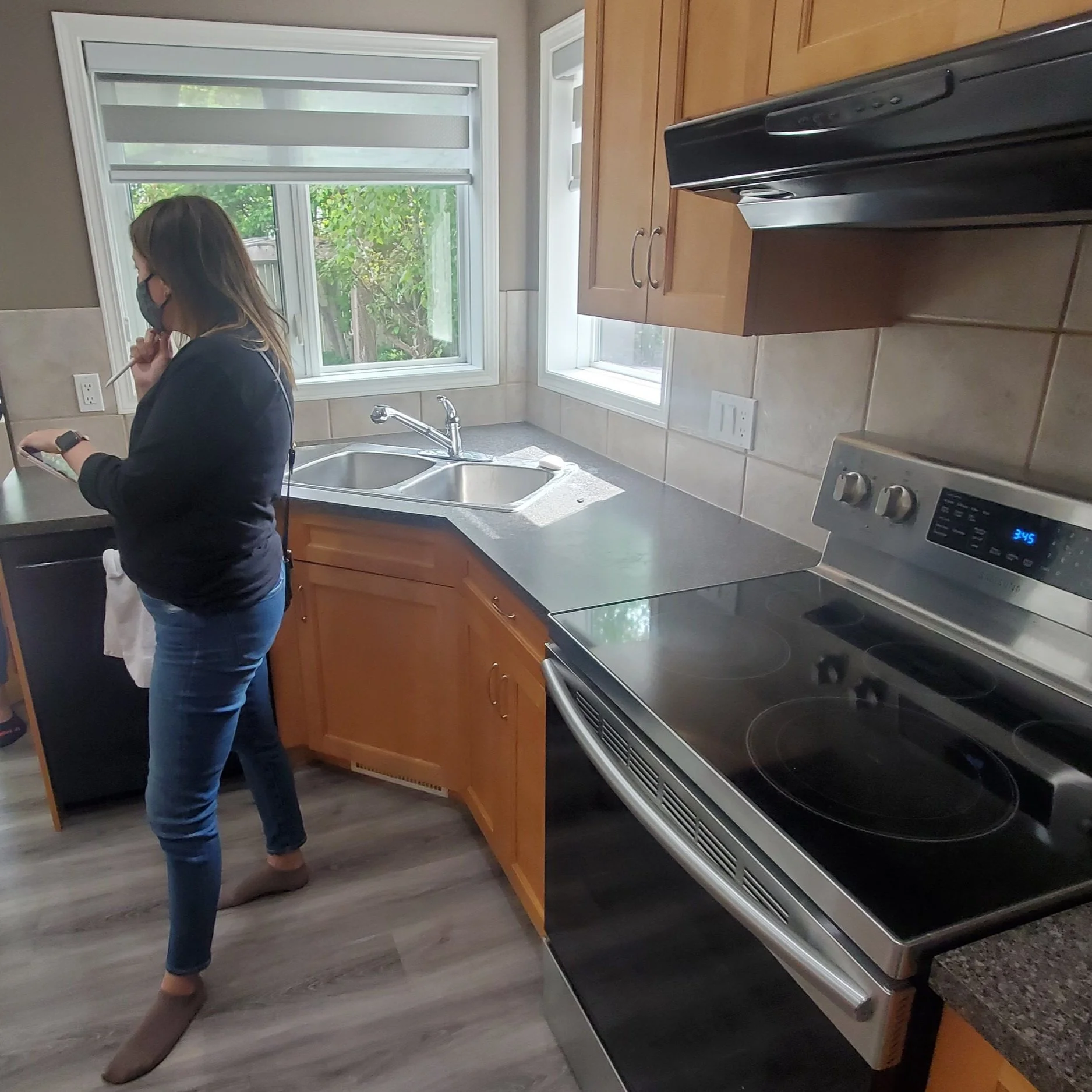
When our client’s bought the home, it was filled with greys and beiges which was making the maple cabinets look dated. It also wasn’t reflective of our clients who are such a beautiful, vibrant family.
We focused on new paint colours to brighten the space, new lighting to modernize the space and an updated look and feel for the kitchen and powder room that worked with the existing kitchen cabinets.
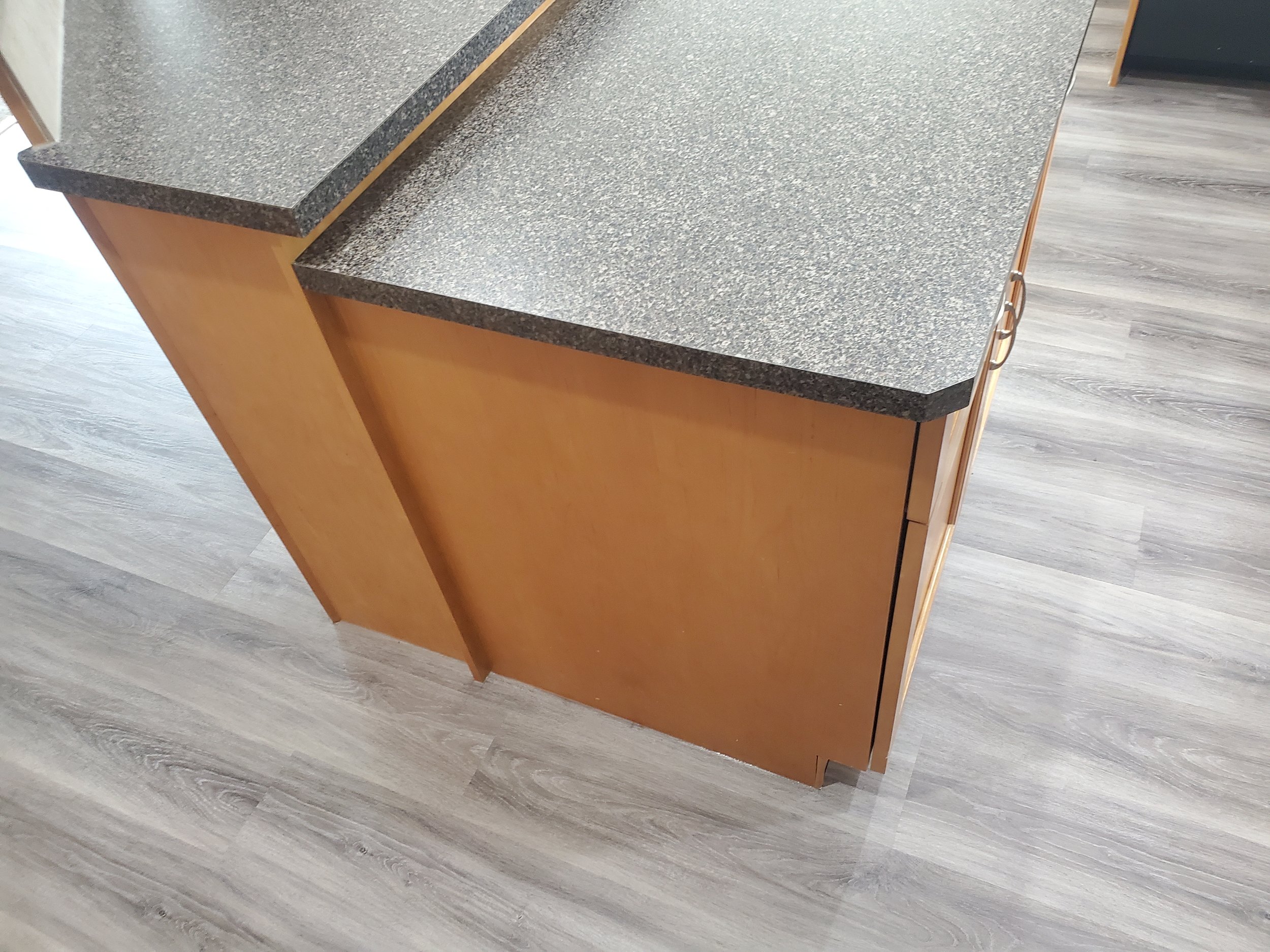
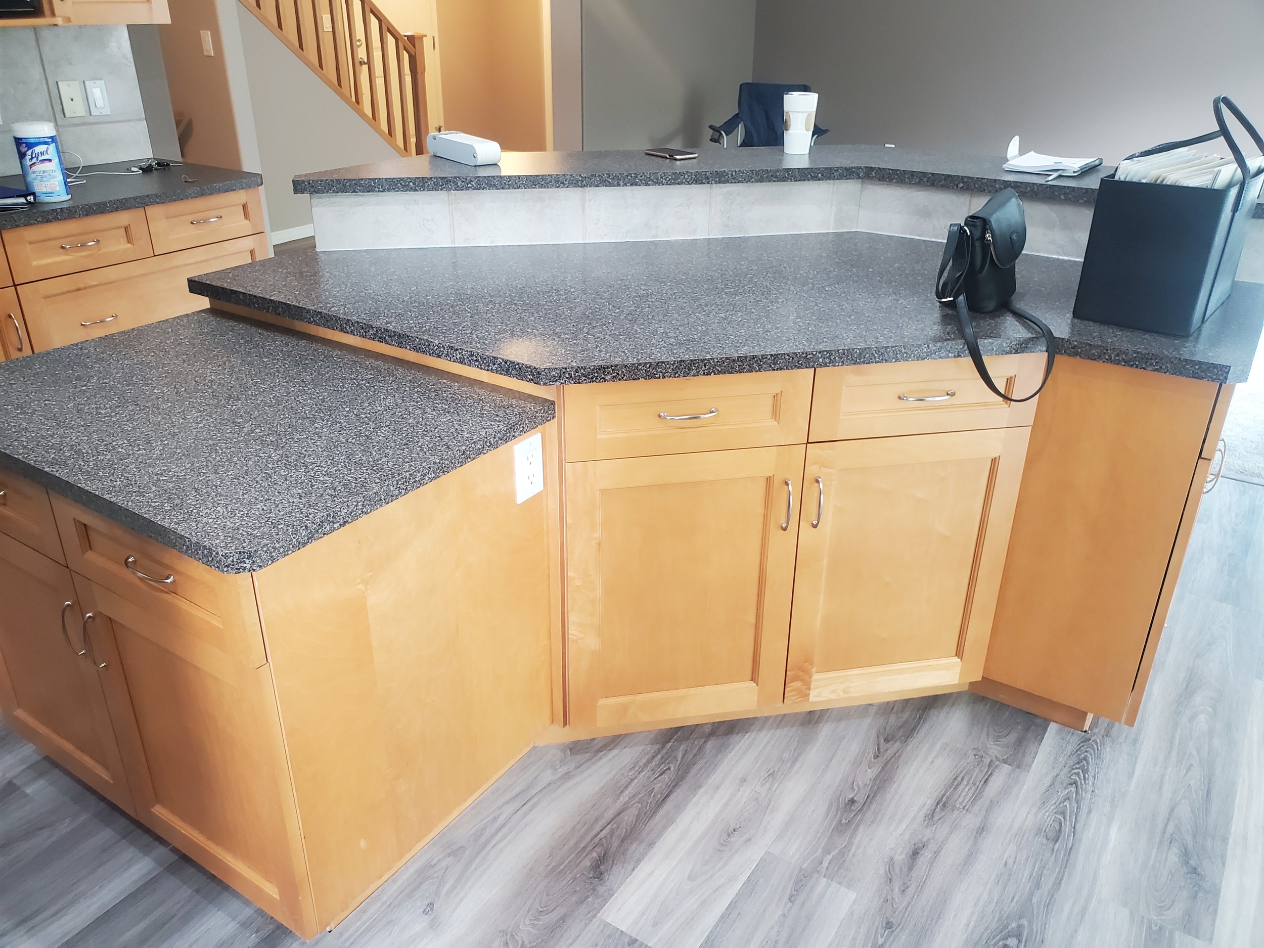
Here’s a look at the before:

Our Design
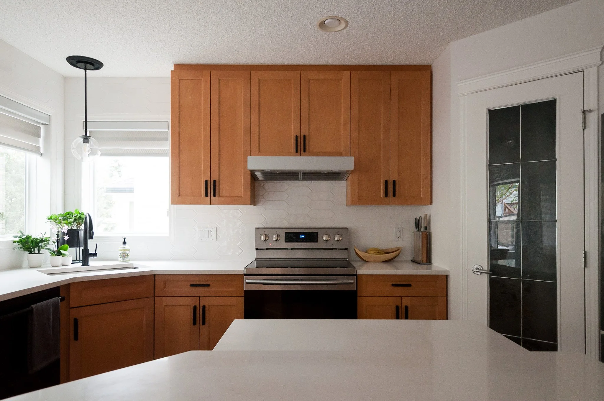
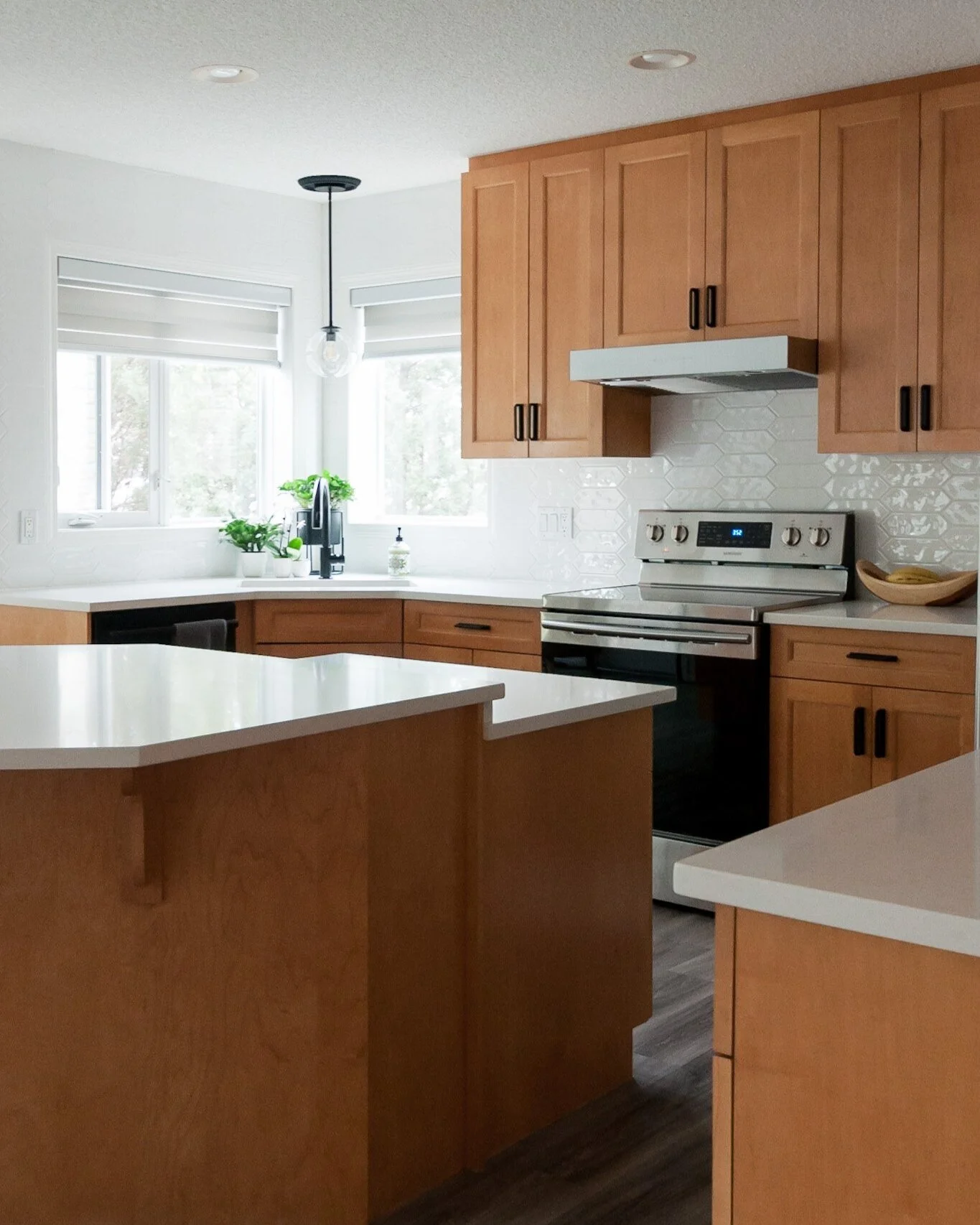
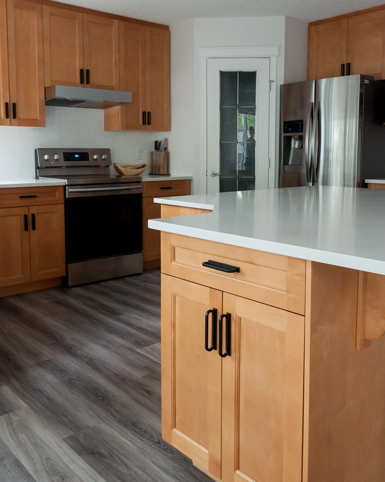
For the kitchen, we came up with two concepts for our clients and ended up doing the first one but with the hardware from the second. In both options we removed the bar height overhang to change it to a counter height overhang. This created a greater surface area for prep and also made the kitchen feel more open to the rest of the space (and more modern too). New countertops and backsplash did the bulk of the heavy lifting and moving away from the grey / greige tones made the maple cabinets look fresh and new again.
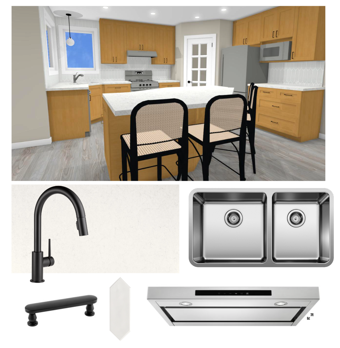
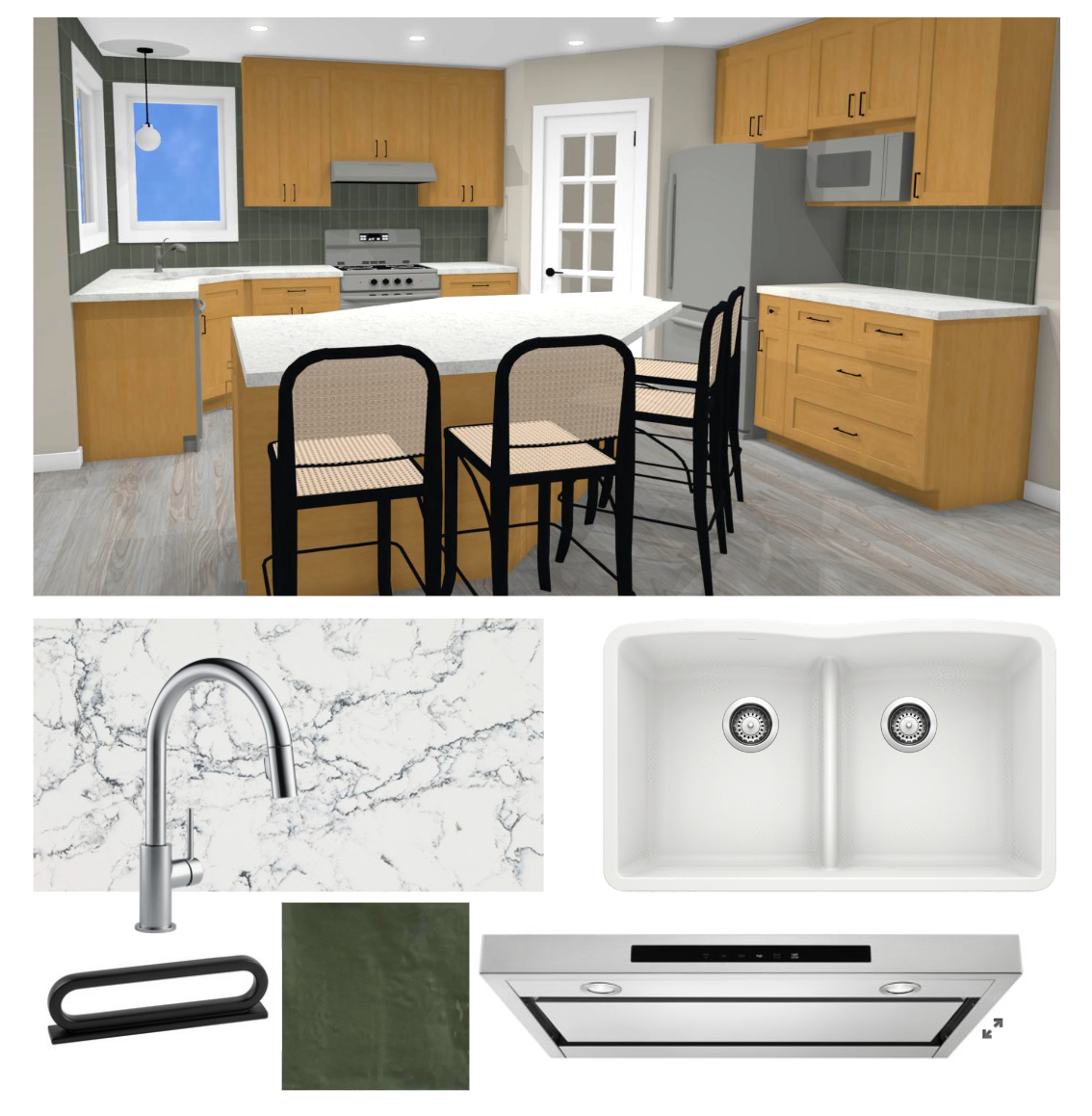
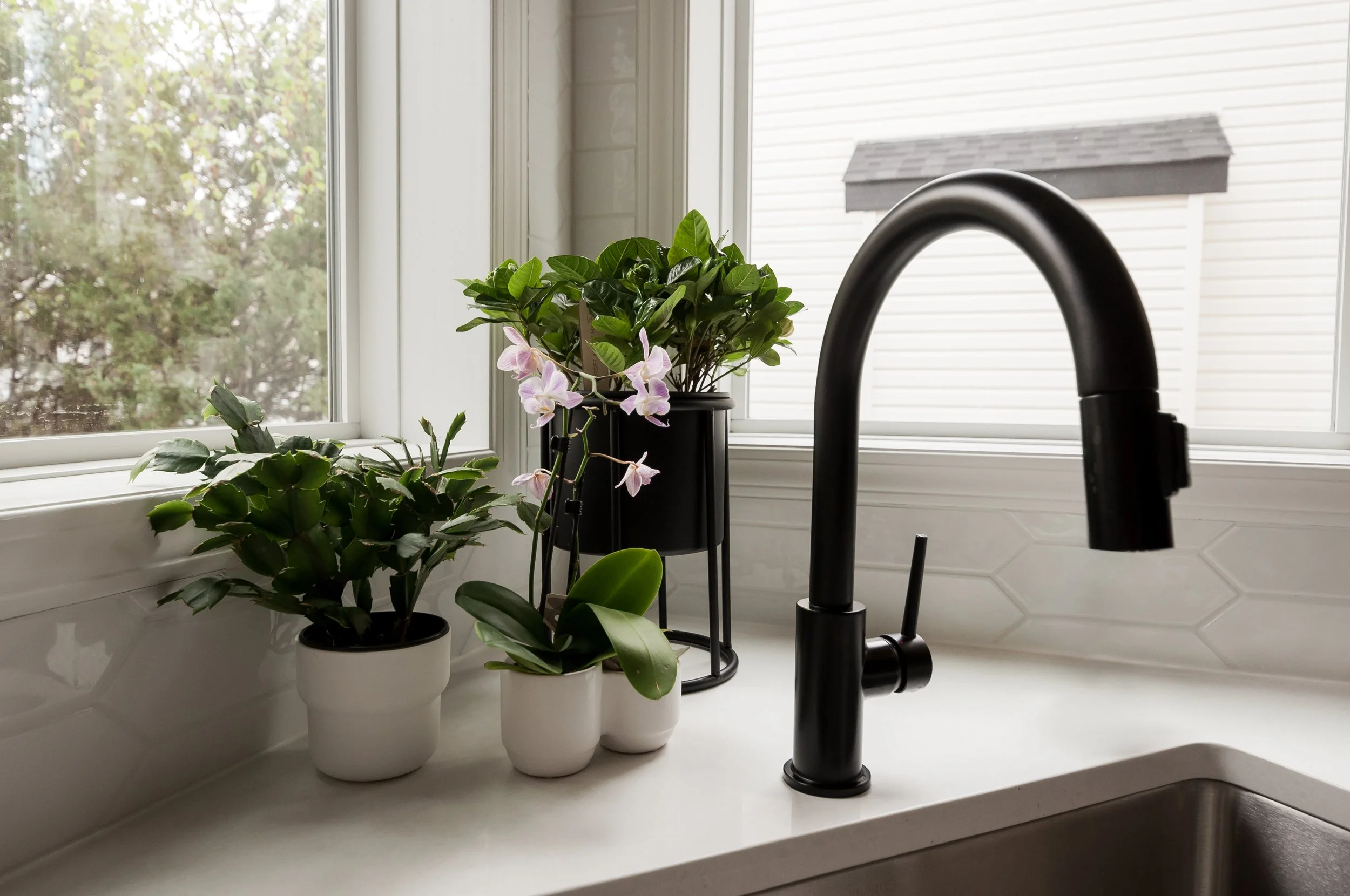
The option they chose had white quartz with a subtle pattern, white picket tile with the backsplash going to the ceiling around the windows, a new stainless steel sink and range hood and black faucet, pendant and hardware.
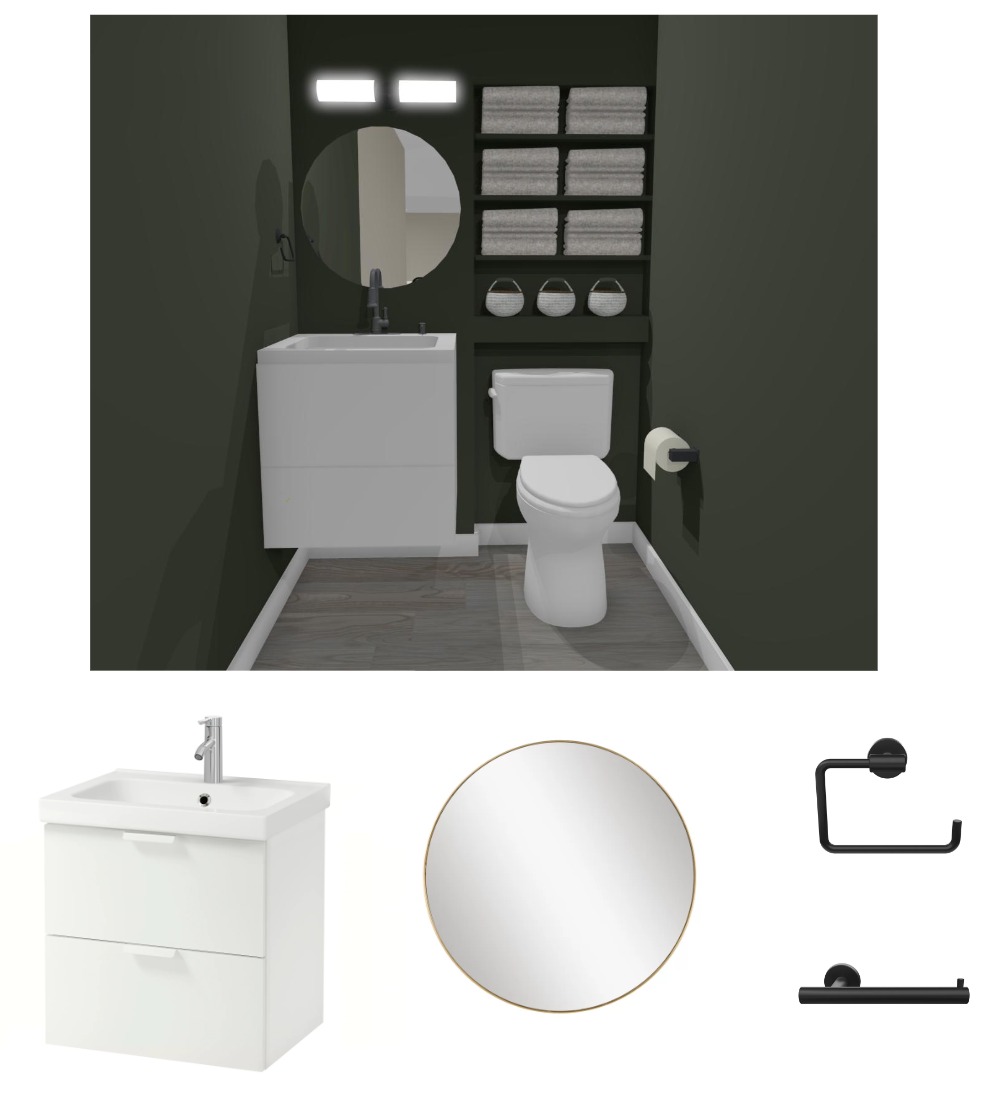
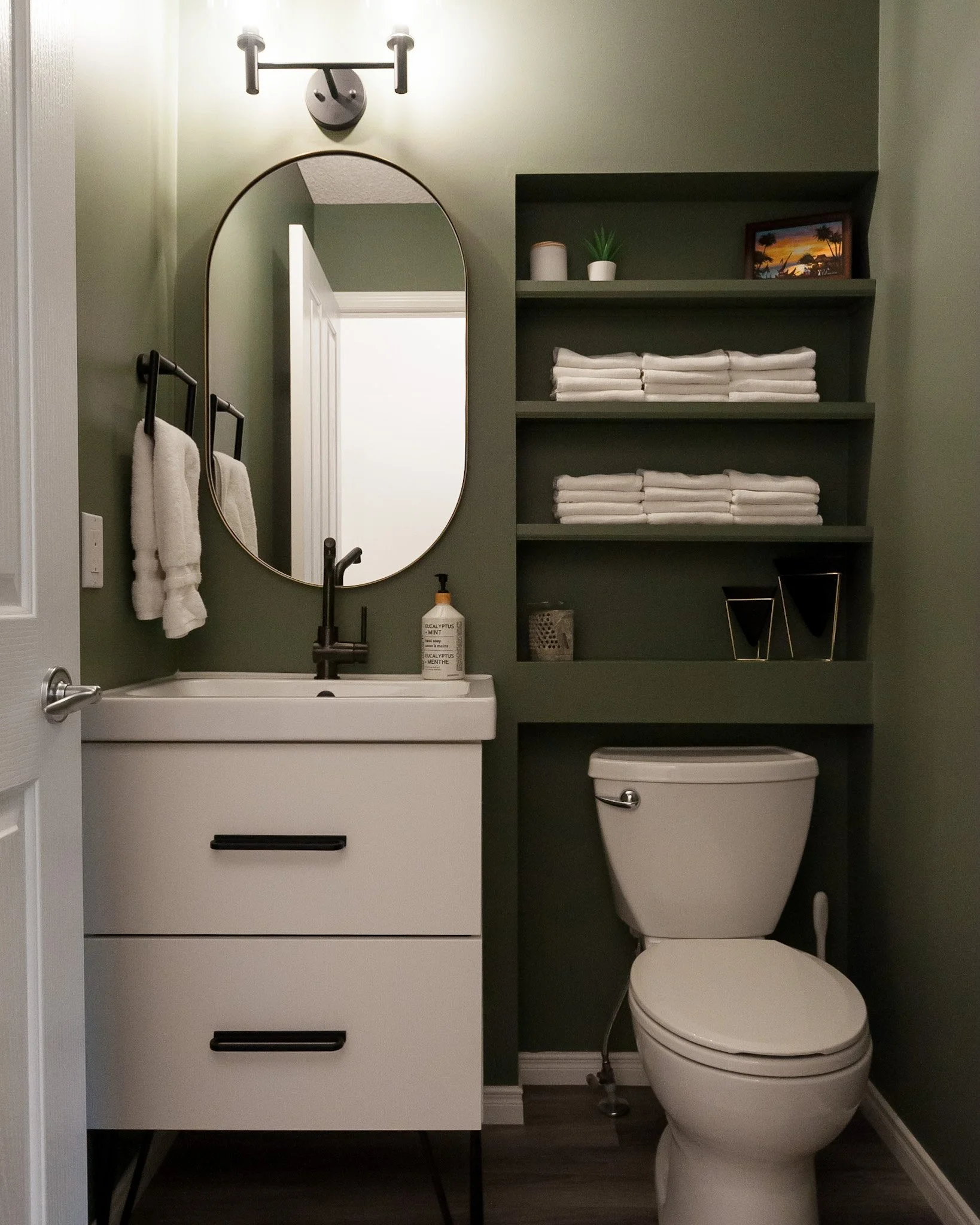
In the powder room, we had pre-selected our accent colour during our Initial Design Consultation (that’s also where we finalized the colours for the rest of the home too, which became Phase 1 of the home’s updates). As we were just updating the vanity to something that had storage and then the pretty elements like the mirror, lighting and hardware, just one option was put forward.
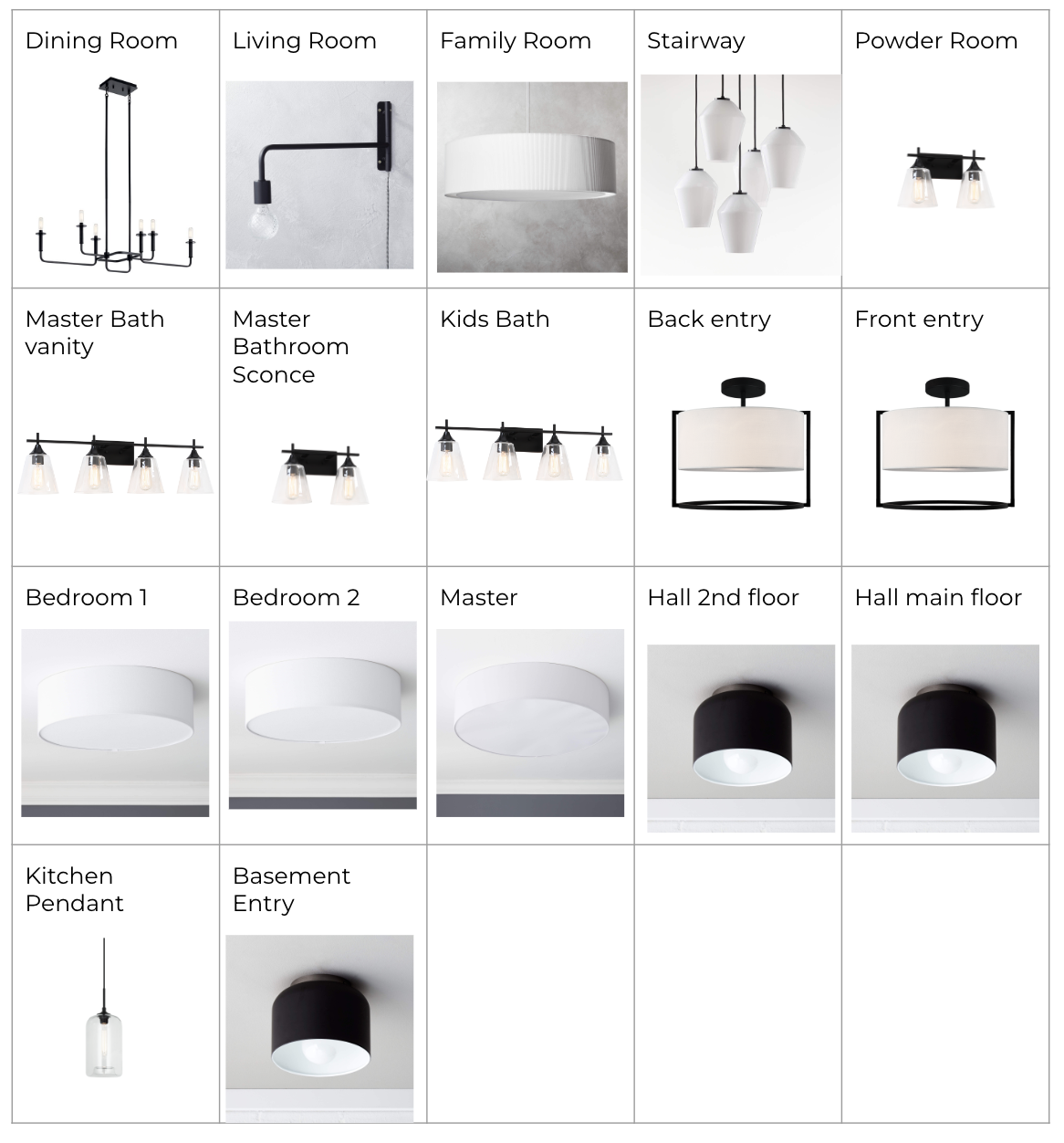
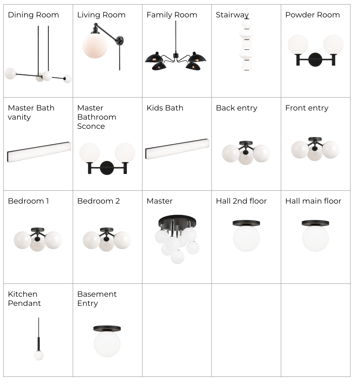
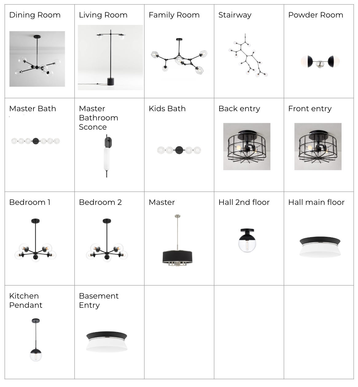
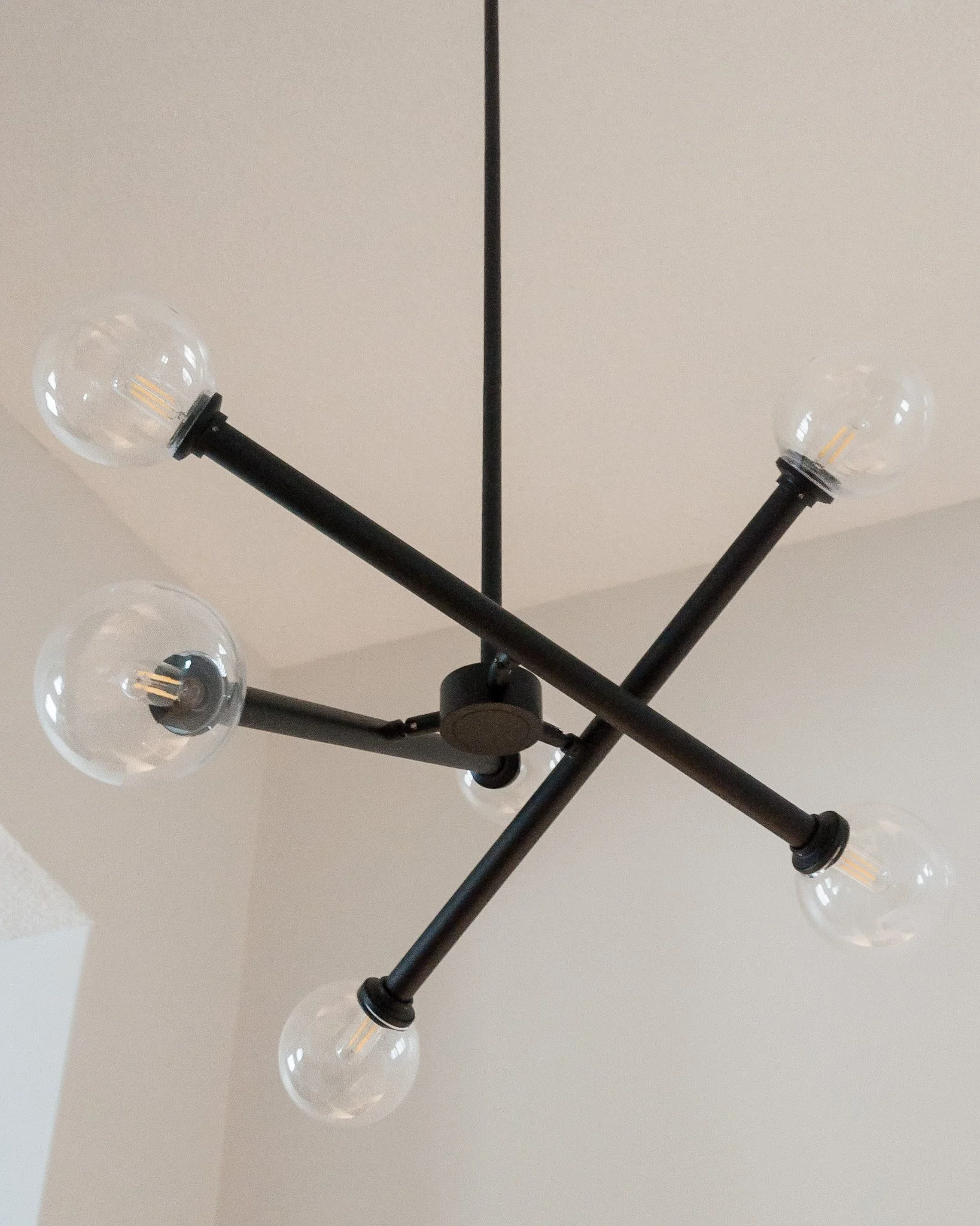
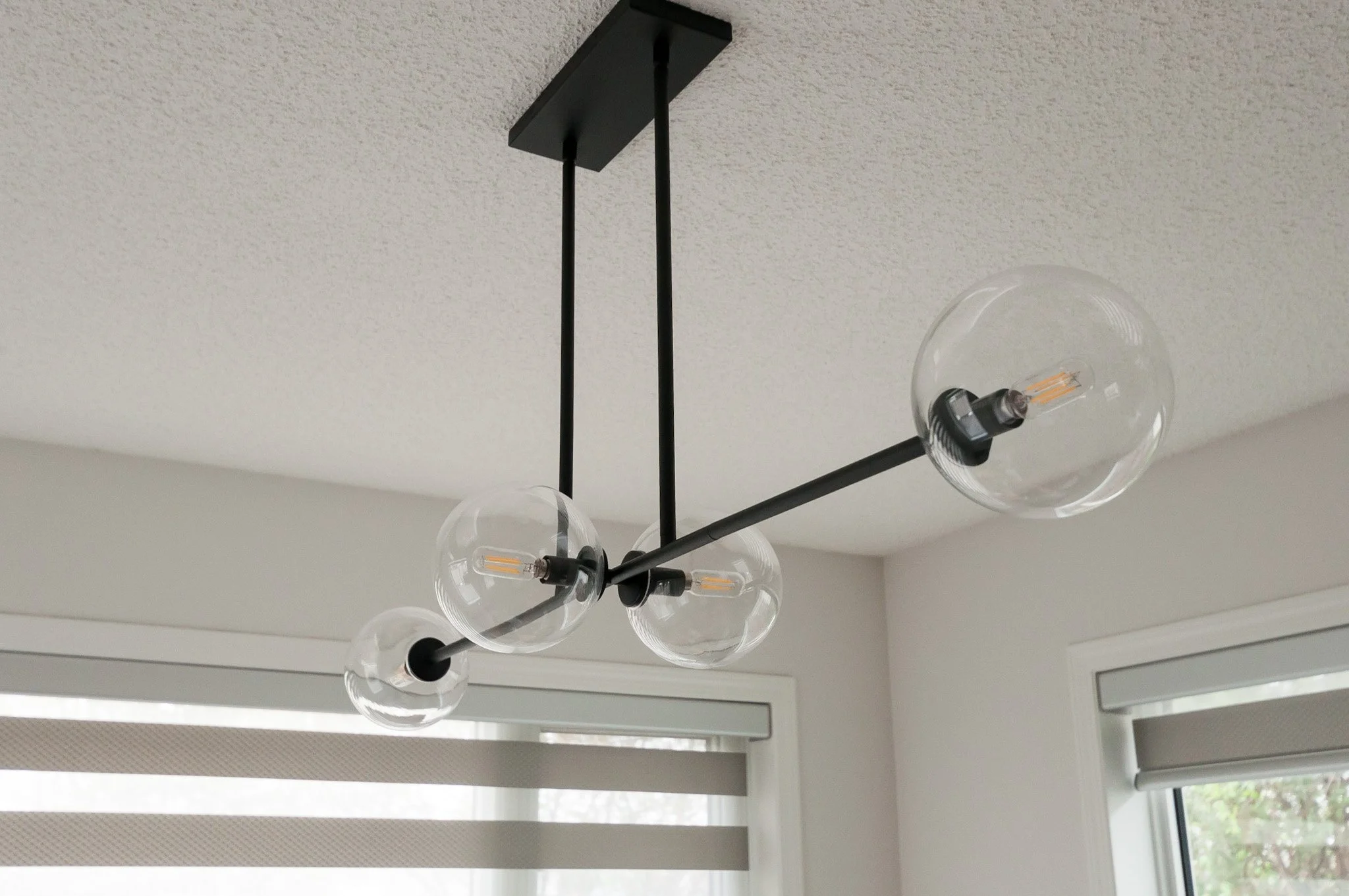
We also put together lighting plans for the whole house and we ended up with a bit of a mix between all 3 (plus a couple changes). This was the one area where we had a bit of back and forth… deciding between a fan vs a standard fixtures for the family room, and then having to make some modifications due to selections going out of stock. We also had a slight bulb debacle where the initial specs were incorrect for one bulb type (which then included some back and forth with the manufacturer), we then ordered the correct ones, only to find they had been mislabeled and weren’t the actual size they should have been but we did eventually get the right bulbs in the end. Remember, there is always something that goes a bit sideways in all renovations!
And we definitely look forward to Phase 3 when we say goodbye to the grey vinyl and hello to a beautiful neutral vinyl that’s going to support the existing maple cabinets instead of competing with them.


The End Result
When I shared a quick before and after of the kitchen on Instagram on our photoshoot day, multiple people messaged to ask if the cabinets were new. That’s how much of an impact we managed to make with minimal updates.
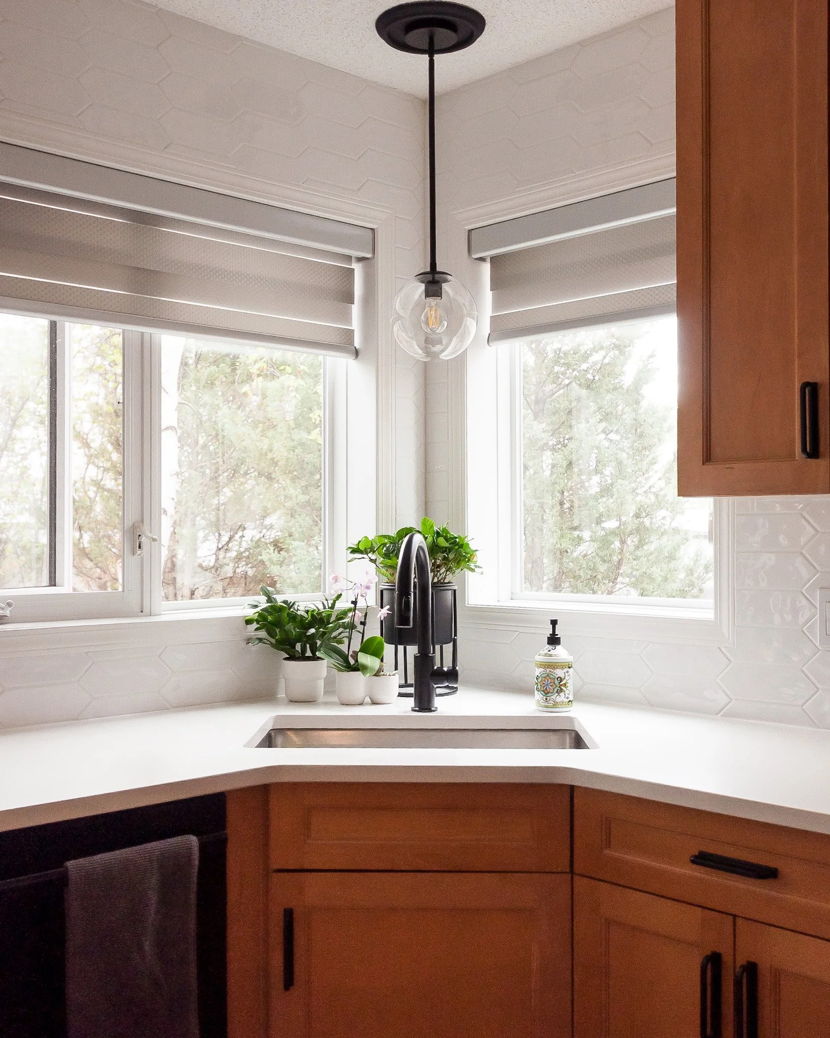
We were pretty excited when we found out that the original recessed light above the sink was on its own switch. It was the perfect spot to add some extra interest with a pendant.
Removing the bar height overhang was an easy change that created a more open and inviting space. We kept the lower portion though near the stove as it adds a bit of interest and is also at a better height for the kids to help out in the kitchen.


Having the backsplash tile going up to the ceiling around the windows heightens the overall look for a minimal additional cost. It’s something we often do in our kitchens to ensure our client’s get the most value for their investment. The subtle texture of the tile catches the light so beautifully and further helps to brighten the kitchen.


We also splurged a bit on the hardware - it’s another area where a small, additional investment can go a long way. Since we replaced the existing pulls with the same size (as we didn’t want to drill additional holes), we also had to add back one single knob. Isn’t it just the cutest?! Fun fact, the original knob was teapot shaped! If you look closely at the before photo that shows the cabinetry to the right of the fridge you may spot it.

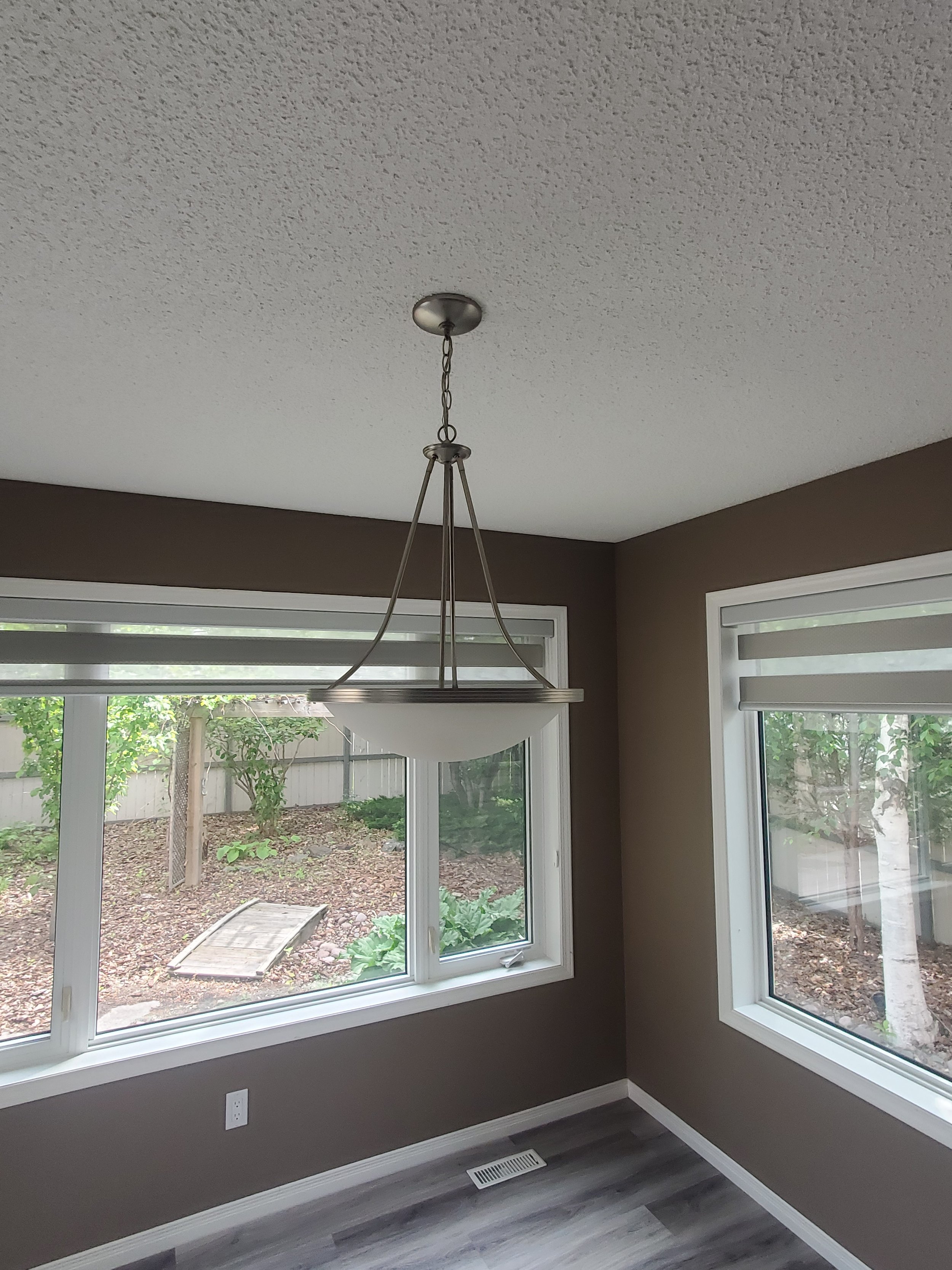
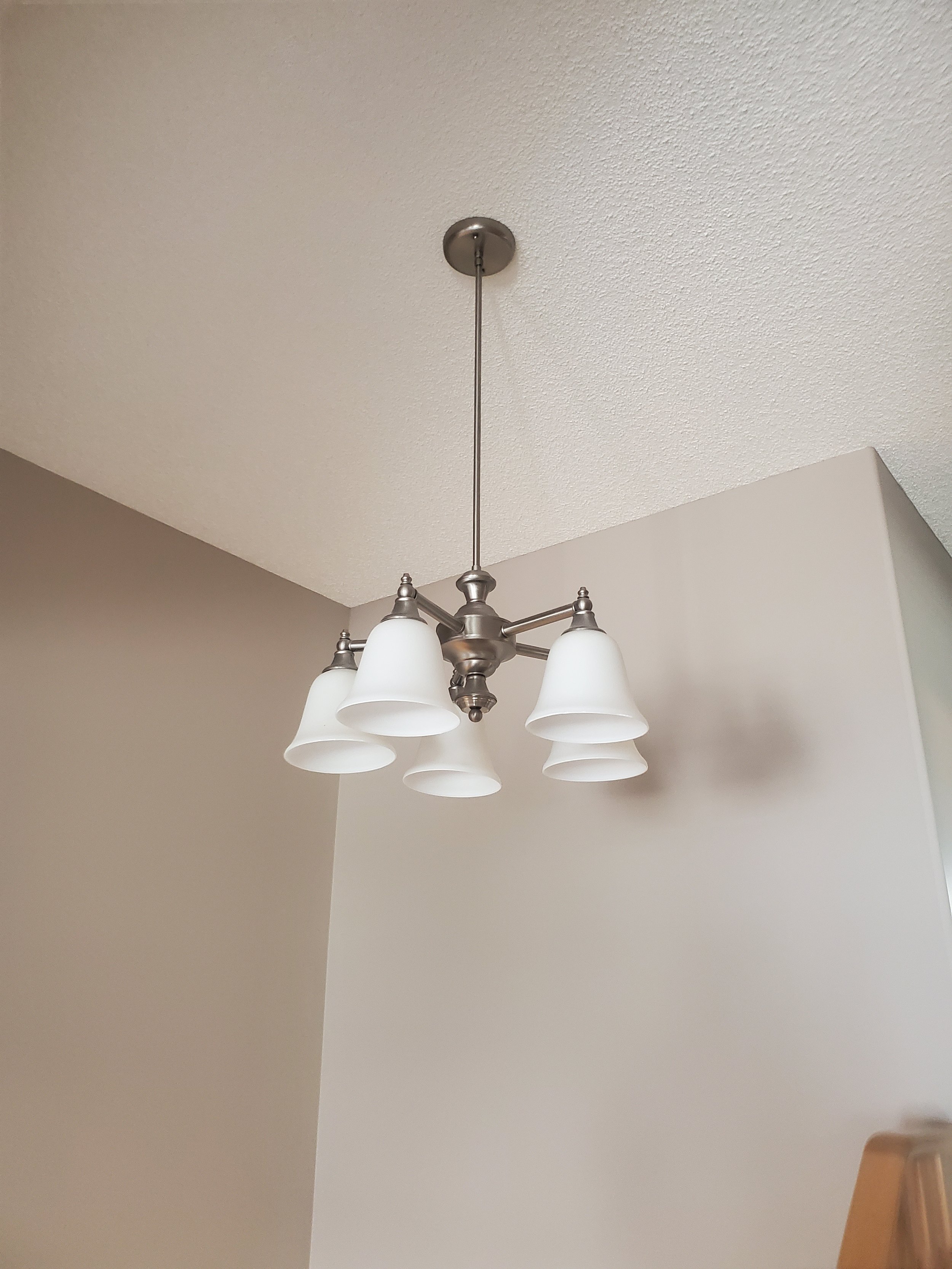
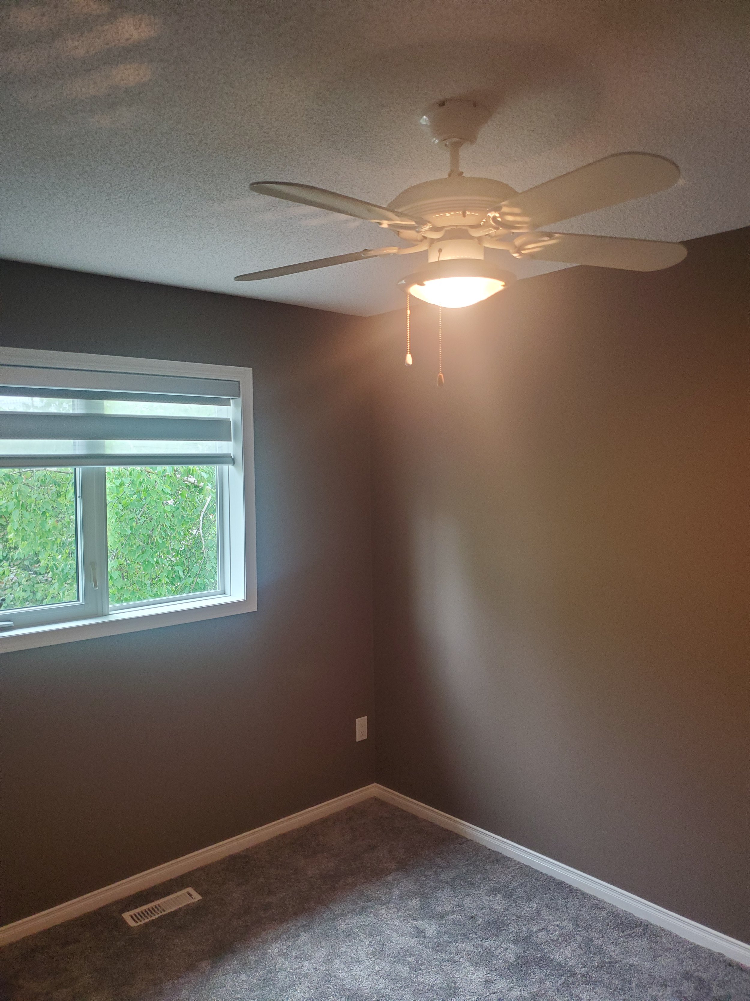
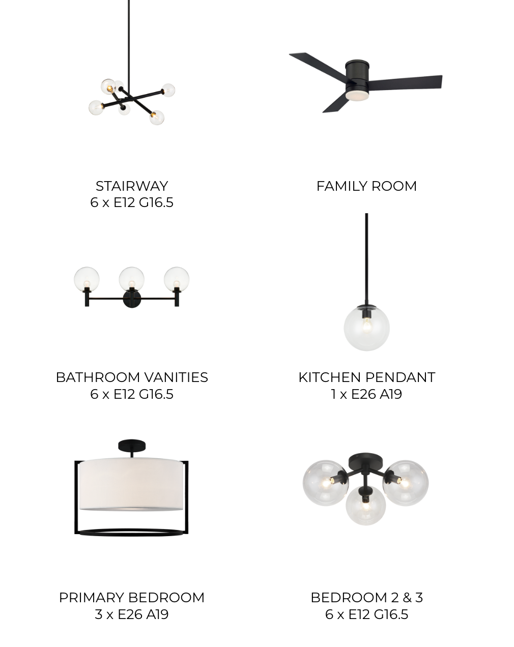
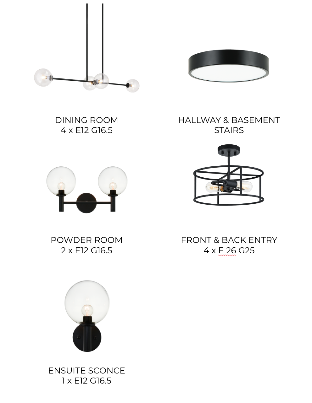
Never underestimate the impact that lighting can make in a space. Truly, if everyone ditched the inexpensive, builder basic, seen everywhere lighting, and replaced them with fixtures that have character, visual impact and bring you joy… well the world would obviously be a better place. Here’s a few of the new fixtures to compare to the before photos: the stairwell, primary bedroom (where there was previously a ceiling fan) and the dining room.

But let’s not forget about the powder room! It’s so satisfying to see how a great paint colour and new fixtures can impact a space.

This refresh is a great reminder that you don’t need to fully replace everything but you may need that professional guidance to ensure that the items that are staying end up looking their best. Whether it’s through our Full Service Design or our Pocket Designer Membership, we love helping homeowners create spaces they love to spend time in. Want to discuss your project? Let’s chat!